Mateo’s banner, product sheet and photography

Mateo’s banner, product sheet and photography

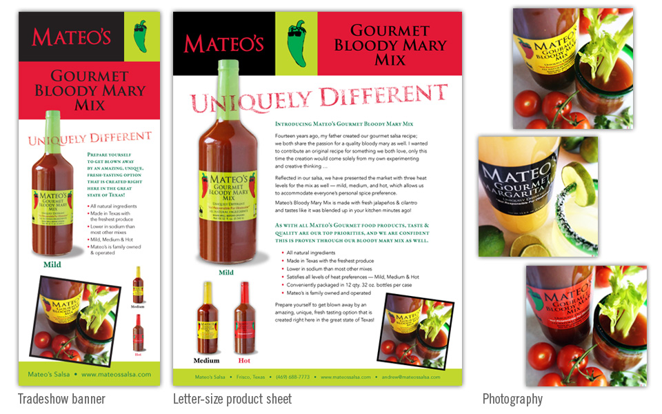
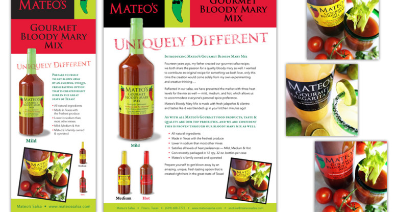
Mateo’s had an existing logo and label design, but had not yet established a look and feel for their print marketing when we stepped into the picture. Most of their sales are to restaurants and retail, so we knew we had to appeal to the business market more than the consumer market.

Our first mission was to photograph the product — bottles only (to show packaging) and product in use (to reinforce the end user’s viewpoint).

Next we designed a product sheet that reflected the colors and Trajan typeface from the logo; we emphasized the “Uniquely Different” tagline by running it over the product photo, putting it on an angle and giving it a rustic texture.

We set the type in two contrasting faces (one serif and one sans-serif) and highlighted part of the the copy with green small caps.

We set the contact info in a green bar at the bottom to draw attention to it. To finish out the layout we added a bold photo of the product in use.

Once we established a look it was easy to create a 7′ tall banner for a tradeshow banner by rearranging and resizing the pieces to fit the new proportion. Although the size is dramatically different, the branding is very consistent.

Mateo’s banner, product sheet and photography

The Hatchery logo

The Hatchery logo

The Hatchery project was a 20-foot-tall climbable wooden tower based on one designed in the early 1900s by Russian artist and architect Vladimir Tatlin. The Dallas version was destined to go to Burning Man, the huge arts and music festival in Nevada, and to go down in flames with the other 30+ CORE projects brought from all over the world.

The project needed a logo to give it an identity for promotion and fundraising purposes, and to set it apart from the other CORE projects that would be working in parallel on their pieces. We designed the logo in the Russian Constructivist style to complement the time period of the original Russian tower project (which was never built).

Characteristics of Russian Constructivism include very strong graphics, elements running on diagonals, red and black color schemes and bold sans serif typefaces. What a fun style to mimic!

The Hatchery logo includes a simplified rendering of the tower (overly complex logos are trouble to reproduce in all the ways one might need to reproduce them, so it’s best to KISS — keep it simple stupid); in the background there is an abstract version of The Man with a star for his head (because we’re from Texas!) and a flame icon.

We chose the typefaces East Bloc (bold & chunky) and Heliotype (condensed) since they are reminiscent of faces from the early 1900s.

As every good designer knows, a good logo works just as well in black and white as it does in color; thus we modified the artwork into a one-color version for tee shirt art. The shirts were used for fundraising and Kickstarter incentives. And wow, were they a hit! Reducing the logo to one color and printing it on a dark shirt as a graphic tee was very well received.

The logo, the fundraising and the tower project were all a huge success!

Shown below are the color logo, the black and white logo on a dark red shirt, and a patch, which was produced in red and black thread on a khaki background.

The Hatchery logo, tee shirt, patch

[grwebform url=”https://app.getresponse.com/view_webform_v2.js?u=mtOf&webforms_id=1454601″ css=”on” center=”off” center_margin=”100″/]


Dallas Bunny Rampage logo

Bunny Rampage logo

We created this fun and colorful logo for the sometimes annual event, Dallas Bunny Rampage.

We chose and customized a cute, cartoony illustration and added a pop of color with the flowers.

The condensed sans serif type follows the round shape of the character’s head; the “HOP” type is set in Vantasyhouse because it’s friendly and whimsical.

Since all the logo elements are light in color, we chose a nice, dark teal as the background in a rounded rectangle shape to finish it off … hop hop hop!

Our Afrika logo

Our Afrika logo

What a fun project this was! We got to design a logo for a small travel agency (yes, they still have those!) created by two lovely South African ladies. Both specialize in creating amazing, unique travel adventures in their home country and other parts of Africa — especially safaris!

We researched traditional African colors and patterns and chose some simple graphic shapes to accent the typographic logo. We replaced the crossbar of the “F” with a diamond and mimicked the shape of the “K” with another.

Then we manually adjusted the letter heights and added the three khaki blocks above and below certain characters to create a pleasing rhythm.

We set “Our” in a nice friendly script, painted it red and outlined it with a stroke of white to pop it off the black “A” to complete the logo. We chose a black, red and khaki color scheme since it’s earthy and vibrant, just like Africa.

Rooooaaaar!

Halloween party invitation poster

Halloween party invitation poster

We have some awesome friends who go all out throwing their annual Halloween bash. Every year there’s a different theme and a new poster to tempt adventurous party-goers.

This year’s theme was Vegas Baby, Vegas! Since the iconic Las Vegas sign art was to be used as a prop at the party, we incorporated it into the poster.

The main emphasis is a beautiful and dramatic photo of a face-painted lady ready for a masquerade ball. We let the photo choice guide the layout as well as our choices for an elegant and contemporary type treatment and the rich, royal colors of gold and purple.

Normally, using four typefaces in a one-panel project is risky, but with as much experience and skill as we wield, it’s a no-brainer. There are so many beautiful typefaces in the world and not enough time to use them all!

We used Bordeaux Roman Bold (Vegas) and Avant Garde Gothic (Halloween Bash) sparingly; we chose Bickham Script (baby and some important tidbits) for contrast and elegance and the workhorse Franklin Gothic for most of the body copy.

Trick or treat? Definitely a treat!
Halloween party invitation poster
Halloween party invitations - email, poster, flyer

Halloween party invitation – email, poster, flyer

These pieces are invitations to a Halloween party. We started by designing the poster with the “Vegas Baby, Vegas” theme.

After the poster art was finished, we moved on to the small printed flyer. Although still vertical, the proportion is very different and required significant layout changes to keep the same look and feel while making sure the information was large and readable.

Lastly we went back to the poster art, shrunk it a bit and nudged things around to fit 8.5″x11″ and exported to jpeg for email purposes.

Although all three of these invitation avenues are very different, we maintained the same dramatic photo and typography look across all of them.


Halloween party invitations - email, poster, flyer

Jeng Chi menu, web site and photography

Jeng Chi menu, website and photography

This project started out as a website redesign, and quickly grew into a menu redesign as well. Since some of the menu offerings and pricing was set to change, it was the perfect time to update the look as well.

We set aside an afternoon to visit Jeng Chi and photograph several dishes that they wanted to highlight on their menu and site. Since the restaurant has some nice architectural and decor pieces we shot them as well, knowing they would be nice to use as background elements for web headers and print work.

We used the round shape of a dramatic interior doorway of the restaurant as a recurring shape on the menu cover and website header. We kept the menu cover fairly simple and emphasized the branding with colors, typography and the Jeng Chi name and characters.

For the inside of the menu we kept the layout clean — three columns with easy-to-read type overlaying a background photo highlighting an item from that page.

The website homepage hosts a photo slider showing off Jeng Chi’s most popular offerings. The online menu, map and hours were the other items the client wanted emphasized on the new site.

The new photography and branding gives Jeng Chi a much needed update; the strong, classy look and feel now match its tasty food.


Jeng Chi menu, web site and photography

Diploma Sender logo

Diploma Sender logo and business package

Diploma Sender is an internet-based service that manages GED testing data and delivers required documents to its test-taker customers. Since they are dealing with people in the education field, they wanted a strong, yet accessible mark for their company.

We chose a dominant “D” and wove a couple decorative elements through it to show motion (for the sending part, of course).

We chose a slab serif typeface since it is friendly and easy to read.

On the letterhead, we placed the logo top right, flush with the right margin of the letters printed to come. The wave element is repeated large and light at the bottom. The business card is designed to match, but the gold is a little stronger to stand out and attract attention, as any good  business card should do.

We also created a seal graphic for their web site to highlight an essay writing contest. It’s friendly, yet official and adds some new curves to the mix.

Diploma Sender logo and package

Spring Party logo

Spring Party logo

We created this charming logo for The Learning Tree, a small private school in Dallas. They throw an annual fundraiser in the springtime and needed a logo for signage and event materials.

The event planners wanted a rustic and friendly logo that included a cowboy on a horse under a tree to complement the western flavor of the venue and catering.

We customized a silhouette cowboy illustration and combined it with a colorful type treatment; the script is appropriately named Giddyup  and resembles a rope-drawn typeface. The condensed face is Birch and fits well nestled under the “g” and “y” above.

A spring party logo calls for some color! Combining red, orange and alternating greens for the type treatment gives the silhouette some much-needed pop.

Quest Recycling Services diagrams

Quest Recycling diagrams

Quest provides recycling services to businesses and needed a series of diagrams to illustrate how they process various items — glass, plastic, organic food, oil, tires, electronic waste, etc.

There are 20 diagrams in the series; each has a graphic representation of the process as well as a brief text description. The style is friendly and simple; the information is thorough. And of course there’s a lot of green!

Quest Recycling Services diagrams