Halloween party invitation poster

Halloween party invitation poster

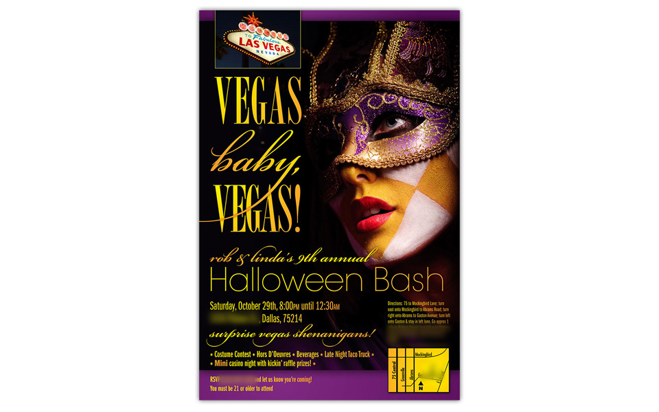
We have some awesome friends who go all out throwing their annual Halloween bash. Every year there’s a different theme and a new poster to tempt adventurous party-goers.

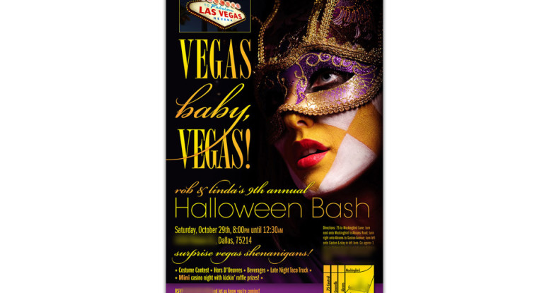
This year’s theme was Vegas Baby, Vegas! Since the iconic Las Vegas sign art was to be used as a prop at the party, we incorporated it into the poster.

The main emphasis is a beautiful and dramatic photo of a face-painted lady ready for a masquerade ball. We let the photo choice guide the layout as well as our choices for an elegant and contemporary type treatment and the rich, royal colors of gold and purple.

Normally, using four typefaces in a one-panel project is risky, but with as much experience and skill as we wield, it’s a no-brainer. There are so many beautiful typefaces in the world and not enough time to use them all!

We used Bordeaux Roman Bold (Vegas) and Avant Garde Gothic (Halloween Bash) sparingly; we chose Bickham Script (baby and some important tidbits) for contrast and elegance and the workhorse Franklin Gothic for most of the body copy.

Trick or treat? Definitely a treat!
Halloween party invitation poster
Quest Recycling Services diagrams

Quest Recycling diagrams

Quest provides recycling services to businesses and needed a series of diagrams to illustrate how they process various items — glass, plastic, organic food, oil, tires, electronic waste, etc.

There are 20 diagrams in the series; each has a graphic representation of the process as well as a brief text description. The style is friendly and simple; the information is thorough. And of course there’s a lot of green!

Quest Recycling Services diagrams

Nelson Westerberg folder inserts

Nelson Westerberg series of flyers

We designed this series of one-page brochures for Nelson Westerberg, an Atlas Van Lines agent (they’ll really move you!).

These flyers do double duty: they can be printed and used as folder inserts and  they can be emailed as PDFs to prospects and clients.

Since Nelson Westerberg’s logo colors are similar to Atlas (red and blues), we chose to play that up with the background shapes and create some nice curves and gradations to set off the information and become a recurring way to brand all the pieces similarly.

The text is the very clean and readable Helvetica Neue.

A colorful, but blue-heavy row of gradated photos rounds out the layout while nicely supporting the brand.

Nelson Westerberg folder inserts

Guardian flyer

Guardian Association Management flyer

Every new company needs a logo and flyer to launch its marketing efforts. After we designed the Guardian logo, we turned to a full-color flyer.

Since they are marketing their  management services to HOAs, we knew the design needed to be professional, yet friendly.

The front side is very clean with a lot of white space, large headline, colorful row of happy people photos, minimal text and a large logo. We also ran the company name up the right side to reinforce it and help establish name recognition.

The back side has info about their services and how to reach them.

Community is important to them — and showing off their strengths is important to us.

Guardian flyer

Lights on Afterschool trifold invitation

Lights on Afterschool invitation

Non-profit organization Dallas Afterschool Network needed a vibrant invitation to get community members “on board” for an annual tour of afterschool programs that are making a difference in the Dallas community.

We started the design with a very graphic and colorful photo of a school bus for the cover.

The inside shows children involved in learning activities and is followed by the invitation copy and the info for the three tour options, as well as the RSVP request.

The information is well-organized and easy to read; the black background causes the photography to really pop.

The back of the invitation talks about the program and reinforces the branding with the relevant logos.

All aboard!

Lights on Afterschool trifold invitation