Spoken Memories book for DJHS

Spoken Memories book for DJHS

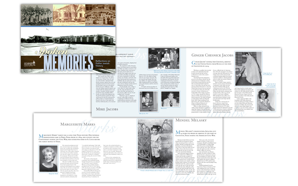
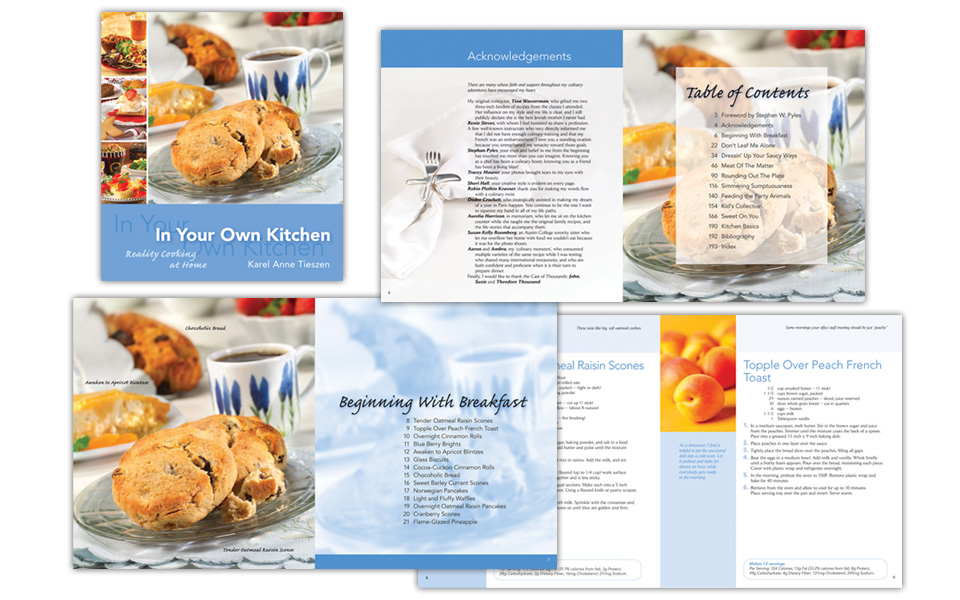
Dallas Jewish Historical Society wanted to create a book to document the oral histories it had collected from many of the key characters in Dallas’ Jewish history.

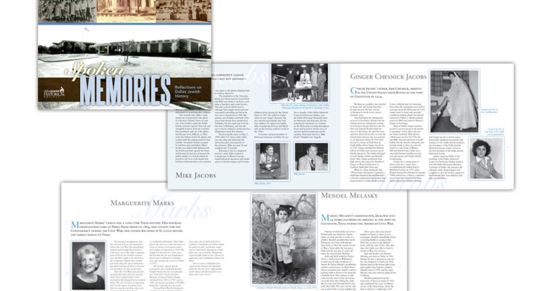
Although the book is over 200 pages, we kept the layout fresh and interesting by creating a flexible 4-column layout; using a blue tint for an all-over background color on some pages; accenting headlines by occasionally layering a script underneath; setting the intro paragraph for each person in small caps; and adding white frames with soft shadows to all photos to maintain their antique feel.

The result is a beautiful book that honors many key players in Dallas’ rich history.

Spoken Memories book for DJHS

Parish Episcopal School annual report and magazine

Parish Episcopal School annual report and magazine

This 60+ page piece doubles as Parish’s seasonal magazine (the Corner) as well as its annual report.

In keeping with their established design style, we used large color blocks to set off colorful photography of school life. The headlines, while set in very classical faces have a fun and friendly rhythm to them.

Professional, but not stodgy — it’s perfect for Parish!

Parish Episcopal School annual report and magazine

In Your Own Kitchen cook book

In Your Own Kitchen cook book

This fun project was a 200+ page cook book written by a chef/cooking teacher.

Each section of the book has a different color theme starting with blue for breakfast. We designed the typography to be easy to read and follow at a distance. We supplemented custom photography with royalty-free, and the final piece is gorgeous — without breaking the bank.

In Your Own Kitchen cook book

Dr. Boldt endowment brochure

Dr. Boldt endowment brochure

This brochure is the official announcement and fundraising kick-off for an endowed chair in gynecological surgery in honor of Dr. John Boldt at The University of Texas Health Science Center at San Antonio.

The design mission called for the layout, color scheme and typography to be a little festive (to celebrate a career) and a little serious (to launch a fundraising effort). We accomplished this with shades of blue and brown, layered typography in an upscale script & a classical serif typeface and some subtle, well-places typographic embellishments.

Dr. Boldt endowment brochure

Mira Vista Ranch brochure and card

Mira Vista Ranch brochure and card

Located in Lewisville, Texas, the Mira Vista Ranch apartment homes development was inspired by Napa Valley and its rich heritage of winemaking.

We designed the brochure and card to match — deep, rich colors, inviting photography, multi-layered, textured backgrounds, upscale script and serif typefaces all come together to provide a strong background for floorplans and community details.

Mira Vista brochure and card