Nelson Westerberg folder inserts

Nelson Westerberg series of flyers

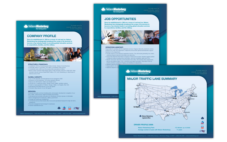
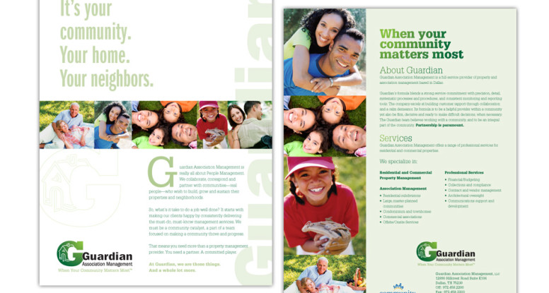
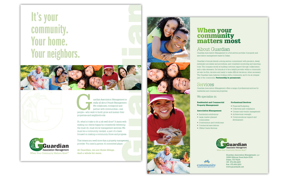
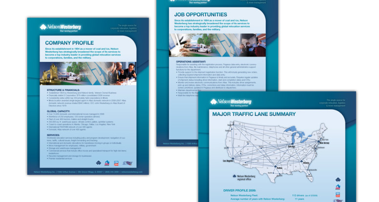
We designed this series of one-page brochures for Nelson Westerberg, an Atlas Van Lines agent (they’ll really move you!).

These flyers do double duty: they can be printed and used as folder inserts and  they can be emailed as PDFs to prospects and clients.

Since Nelson Westerberg’s logo colors are similar to Atlas (red and blues), we chose to play that up with the background shapes and create some nice curves and gradations to set off the information and become a recurring way to brand all the pieces similarly.

The text is the very clean and readable Helvetica Neue.

A colorful, but blue-heavy row of gradated photos rounds out the layout while nicely supporting the brand.

Nelson Westerberg folder inserts

Guardian Association Management logo, website, flyer

Guardian logo, website and flyer

This project includes all the basics a new company needs: a logo, a simple website and a one-page printed flyer that doubles as an emailable PDF.

We started with the logo design (we always start with the logo design as it sets the look and feel for everything that follows!); because the client was on an accelerated schedule to launch their business, we designed the website and flyer concurrently.

The green & green color scheme and the typeface choices we made for the logo influenced the colors and type on the other pieces.

We chose several happy people photos (royalty-free) and built a small library of photography to use on all Guardian work to achieve a consistent look.

Everything works well together and shows off the clean, professional and friendly look of the Guardian brand.

Ta-da!

Guardian Association Management logo, website, flyer

Guardian Assoc. Management logo

Guardian Association Management logo

A logo mark for a home association management company should be strong and stable looking, but not big and scary. In keeping with that directive we accentuated the company name with a large capital “G” set in Rockwell Extra Bold; it’s filled with a green to green gradation that becomes a background for a simple house illustration.

The company name is set in the sans serif face Franklin Gothic and is nestled into the “G” with a white stroke around to pop it off the green.

We created a couple versions of the logo because the client wanted the option to have their tagline incorporated. The tag is set in Glypha, a very legible and friendly slab serif face and picks up the lightest green from the gradation in the “G.”

It’s a clean, strong, memorable mark — just what the client asked for!

Guardian flyer

Guardian Association Management flyer

Every new company needs a logo and flyer to launch its marketing efforts. After we designed the Guardian logo, we turned to a full-color flyer.

Since they are marketing their  management services to HOAs, we knew the design needed to be professional, yet friendly.

The front side is very clean with a lot of white space, large headline, colorful row of happy people photos, minimal text and a large logo. We also ran the company name up the right side to reinforce it and help establish name recognition.

The back side has info about their services and how to reach them.

Community is important to them — and showing off their strengths is important to us.

Guardian flyer

Lights on Afterschool trifold invitation

Lights on Afterschool invitation

Non-profit organization Dallas Afterschool Network needed a vibrant invitation to get community members “on board” for an annual tour of afterschool programs that are making a difference in the Dallas community.

We started the design with a very graphic and colorful photo of a school bus for the cover.

The inside shows children involved in learning activities and is followed by the invitation copy and the info for the three tour options, as well as the RSVP request.

The information is well-organized and easy to read; the black background causes the photography to really pop.

The back of the invitation talks about the program and reinforces the branding with the relevant logos.

All aboard!

Lights on Afterschool trifold invitation

Spoken Memories book for DJHS

Spoken Memories book for DJHS

Dallas Jewish Historical Society wanted to create a book to document the oral histories it had collected from many of the key characters in Dallas’ Jewish history.

Although the book is over 200 pages, we kept the layout fresh and interesting by creating a flexible 4-column layout; using a blue tint for an all-over background color on some pages; accenting headlines by occasionally layering a script underneath; setting the intro paragraph for each person in small caps; and adding white frames with soft shadows to all photos to maintain their antique feel.

The result is a beautiful book that honors many key players in Dallas’ rich history.

Spoken Memories book for DJHS

Cherry's Bad Ass Beef Jerky logo

Cherry’s Bad Ass Beef Jerky logo

You can probably tell by this art that this was a fun project for a very fun client! Cherry had a knack for making jerky and wanted to start selling it to friends & family … and their friends … and their friends. She was 5 days away from being featured in the Dallas edition of Thrillist (a digital daily dose of hip new products you can’t live without) and desperate for a logo — Soleil Design to the rescue!

Cherry has a lot of colorful tattoos and wanted a skull icon with a Day of the Dead feel. She also wanted to explore some Western and fun kitschy cowgirl imagery. We did extensive image research and conferred with her to get feedback and narrow the direction; we designed a pink and black skull icon at the center of a very decorative Western circular frame. The typefaces we chose are rustic but chic. Cherry was drawn to two of the logos we came up with and wanted to use the vertical orientation for the web site and business card and the circular seal for labels and packaging. And that’s how we ended up with a bad ass chick logo (or two), just in time for her Thrillist debut!

Cherry's Bad Ass Beef Jerky logo

Salt River Capital logo

Salt River Capital logo & card

We designed this logo for a start-up company that raises investment capital for multi-family residential real estate developments.

The icon is a solid R with an abstract river shape flowing through it. We chose the stable colors of  blue and black and the Adobe Garamond typeface to give the new company the air of an well-established organization.

Salt River Capital logo and card

Parish Episcopal School summer school ad

Parish Episcopal summer school ad

This full-color ad ran in community papers in the wintertime to get people thinking about Parish’s Summer School offerings.

We kept the info very simple (what, when, where, contact) so that the logo and photo could take center stage. We carried the branding of the sun color and shape in the logo to the background of the copy. This ad is fun, colorful, active and inviting — and sets the stage well for a full program of summer activities.

Parish Episcopal School summer school ad

Doc Design logo

Doc Design logo and card

Doc Design was created to offer turnkey office set-up services to health care providers — anything from web design to office  furniture and phone systems.

The logo type consists of two weights of Futura: the top is larger and lighter; the bottom is smaller and bolder so they both line up nicely as a block element.

The center of the “O” became the perfect place to add a cross icon and radiate out from it a pattern of circles, representing all of Doc Design’s services coming from one source.

The two-sided business card has a nice clean layout with a white background on the front and a blue background with list of services on the back. The gradation circle pattern is faintly echoed in the top left corner.

It’s amazing what you can do with two colors … if you know what you’re doing!

Doc Design logo and business card