Deltan Group logo

Deltan Group logo and business package

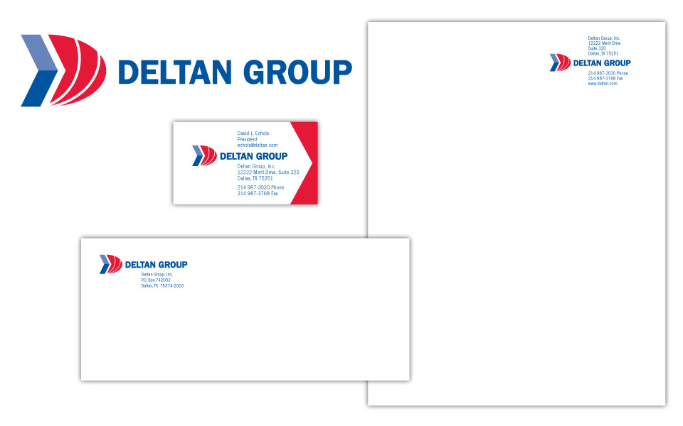
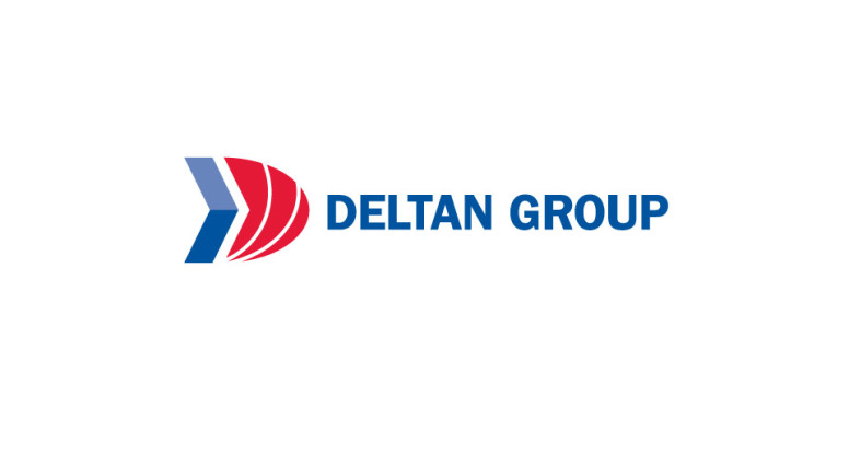
This project was to redesign a logo for an existing company, Deltan Group. The client wanted an icon to accentuate the letter D and show some movement; he also wanted to use bold, conservative colors. We created an abstract capital D out of a blue arrow shape and a solid red curve with 2 white arcs reversed out of it. Since Deltan offers business computer services in the Windows-verse we chose Franklin Gothic for the logo and contact copy (similar type family to the MS mothership).

We wanted to have a little fun with the business card and carry the theme of movement even further; we added red angles to the right end of the card to let the white negative space become an arrow, with the same angle as the iconic D of the logo.

In addition to the basic letterhead, we designed a shell that Deltan could print company info on in-house and slip into a pocket folder. The shell art repeats the blue arrow from the logo in the left margin and has the D icon blown up larger than life in the background.

Simple, strong, effective.
Deltan Group logo and business package
Riney Palter logo

Riney Palter business package

We chose traditional (but certainly not stodgy!) colors and typefaces for this logo because it’s for a law firm. We worked a subtle star element into the logo; in replacing two quadrants of the star with letter blocks, the partial star doubles as an arrow adding some motion to the icon.

Riney Palter business package

Lone Star Furnishings logo

Lone Star Furnishings business package

We designed this logo and business package for a client who was looking for something a little rustic yet strong and conservative. The copper is a metallic ink and the star is embossed on print applications.

Lone Star Furnishings business package

Southwest Women's Business Works! logo

Southwest Women’s BusinessWorks! logo

We designed this logo for a conference and trade show for the Women’s Business Council Southwest. They needed something strong, but not flashy and not overly feminine. We went with a text treatment only — no graphics; as you can tell, just because there aren’t any graphics doesn’t mean a logo has to be bo-ring. We varied which letters were upper case and which were lower to achieve an attractive and interesting balance. It’s a little like putting a puzzle together — but we get to create our own pieces! We chose to eliminate the dot over the i in business because it wasn’t necessary for readability (our brains are amazing at filling in the blanks in cases like this), and would have interfered with the text above.

We like the choice of Mrs Eaves type family since it has a nice delicate quality to its serfis (the feet at the end of the characters) and has a flowing italic, but doesn’t scream lipstick. (This is also the typeface the WBCS organization uses for its logo, so it made even more sense for consistency reasons.)  The black, gray and red color scheme work to ground and strengthen the logo.

In a word, it works!
Thompson + Company logo

Thompson + Company logo

Since this logo design project was for an accounting firm, it needed to be conservative and corporate, but a little contemporary. The layout is symmetrical (balanced like a balance sheet should be!) and the shape of the black plus is echoed in the negative space (white space) between the blue squares.

We chose Futura in all caps for the type treatment since Futura is the little black dress of the typeface world; it can go anywhere at any time and look stylish. It might surprise most folks to know that Futura was designed in the ’20s—the 1920s!

We carried the boxy feel over to the business package and used the blue square as a recurring element on the card.

Thompson + Company business package