Wyndsor Pointe logo

Wyndsor Pointe logo

We designed this logo for an upscale new housing development in Plano, Texas.

This logo combines a delicate serif typeface for “Pointe” and solid, readable script for Wyndsor. We elected to use a swash character on the “y” and intersect it with the “o.”

We highlighted the capital W with a cast shadow in the script typeface and a lighter color so it doesn’t compete too much. The swashes offset and balance each other well and the printer’s ornament through the middle creates a nice decorative base.

Fancy that!

Stanford Court Villas logo

Stanford Court Villas logo

Stanford Court Villas is an exclusive townhome development in Addison, Texas. The architectural style is upscale, but comfortable Italian, so the logo needed to match. For the color palette, we chose a slightly warm blue and a rust; for the type we chose a strong condensed serif face and an elegant script. The decorative header element finishes it off nicely.

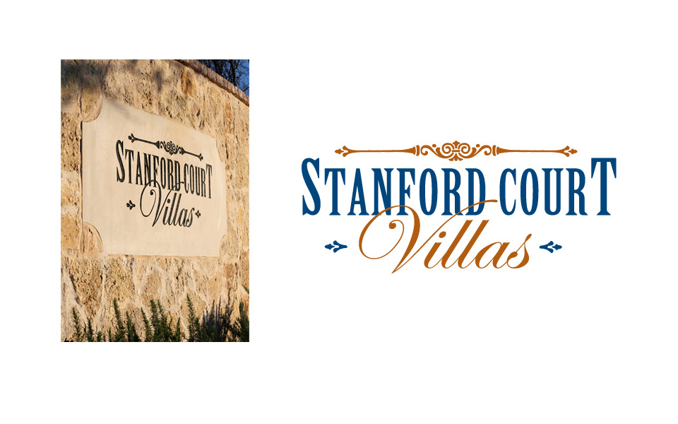
When designing this logo (well, really any and all logos) we kept in mind that it would eventually need to work in just one color, so we did all initial design work in black and white to develop our concepts; we then did color studies after the client picked the logo he wanted to use. And sure enough, the one color version translated beautifully into stone for the monument signage at the entrance to the property.
Stanford Court Villas logo with monument
Ice Cafe logo

Ice Café logo

We enjoyed working with muted textures and colors for a rich logo treatment for Gaylord Texan’s café that accompanied its winter-themed ICE event.

AmerTrans logo

AmerTrans logo

AmerTrans Relocation Services is a Nelson Westerberg company (NW is an Atlas Van Lines agent) that handles all the planning aspects of relocating Fortune 500 companies’ employees across town or across the world.

With a very corporate audience in mind, we designed this logo in traditional red and blue and the conservative serif typeface Trajan (you’ve probably seen this all-caps typeface in movie titles). We integrated an arrow icon for the moving industry and added a flourish to push it in the direction of an abstract A (for AmerTrans, of course!).

CityDoc Uptown Urgent Care logo

City Doc logo

We designed this logo for an urgent care facility in Dallas’ Uptown neighborhood. Since they needed to market to a young professional, Dallas clientele, they wanted something fresh, bold and medical.

We chose to limit the graphics to a simple cross element and surround it by 2 semi circles that create an abstract “C” and “D” for CityDoc.

The type is flush right since that’s a more contemporary treatment; the uptown designation is small so it can be changed to other areas of town if they choose to expand outside of Uptown. It never hurts to think ahead!

We set “urgent care” in a bold red sans serif face to emphasize the service they offer. We chose the type family Avenir because it’s friendly, professional and easy to read.