Guardian Assoc. Management logo

Guardian Association Management logo

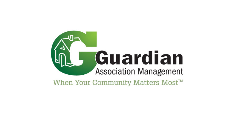
A logo mark for a home association management company should be strong and stable looking, but not big and scary. In keeping with that directive we accentuated the company name with a large capital “G” set in Rockwell Extra Bold; it’s filled with a green to green gradation that becomes a background for a simple house illustration.

The company name is set in the sans serif face Franklin Gothic and is nestled into the “G” with a white stroke around to pop it off the green.

We created a couple versions of the logo because the client wanted the option to have their tagline incorporated. The tag is set in Glypha, a very legible and friendly slab serif face and picks up the lightest green from the gradation in the “G.”

It’s a clean, strong, memorable mark — just what the client asked for!

Cherry's Bad Ass Beef Jerky logo

Cherry’s Bad Ass Beef Jerky logo

You can probably tell by this art that this was a fun project for a very fun client! Cherry had a knack for making jerky and wanted to start selling it to friends & family … and their friends … and their friends. She was 5 days away from being featured in the Dallas edition of Thrillist (a digital daily dose of hip new products you can’t live without) and desperate for a logo — Soleil Design to the rescue!

Cherry has a lot of colorful tattoos and wanted a skull icon with a Day of the Dead feel. She also wanted to explore some Western and fun kitschy cowgirl imagery. We did extensive image research and conferred with her to get feedback and narrow the direction; we designed a pink and black skull icon at the center of a very decorative Western circular frame. The typefaces we chose are rustic but chic. Cherry was drawn to two of the logos we came up with and wanted to use the vertical orientation for the web site and business card and the circular seal for labels and packaging. And that’s how we ended up with a bad ass chick logo (or two), just in time for her Thrillist debut!

Cherry's Bad Ass Beef Jerky logo

Salt River Capital logo

Salt River Capital logo & card

We designed this logo for a start-up company that raises investment capital for multi-family residential real estate developments.

The icon is a solid R with an abstract river shape flowing through it. We chose the stable colors of  blue and black and the Adobe Garamond typeface to give the new company the air of an well-established organization.

Salt River Capital logo and card

Doc Design logo

Doc Design logo and card

Doc Design was created to offer turnkey office set-up services to health care providers — anything from web design to office  furniture and phone systems.

The logo type consists of two weights of Futura: the top is larger and lighter; the bottom is smaller and bolder so they both line up nicely as a block element.

The center of the “O” became the perfect place to add a cross icon and radiate out from it a pattern of circles, representing all of Doc Design’s services coming from one source.

The two-sided business card has a nice clean layout with a white background on the front and a blue background with list of services on the back. The gradation circle pattern is faintly echoed in the top left corner.

It’s amazing what you can do with two colors … if you know what you’re doing!

Doc Design logo and business card

Rudy’s Tortillas 65th anniversary logo

Rudy’s Tortillas has been in business since 1945 and wanted to celebrate their 65th anniversary all year long. One way we helped them achieve this was to redesign their existing business cards (which we had already designed) and add a special 65th anniversary logo.

We chose to keep the 65th logo colors consistent with the colors we had established for Rudy’s cards. It’s usually frowned upon to use so many different fonts in one project, but if you’re a typographic ninja you can make it work! We were careful to use three families that are very different from each other, and we used one of them very sparingly. We used Trajan for the “65” (that’s all, folks), then used Shelley Script for the “th” and “Anniversary” while using Rudy’s existing face Avenir for the rest.

Next, the addition of a simple arc of stars suggests movement and celebration. The colors, fonts and shapes balance each other well and are grounded by a simple decorative baseline.

Congrats on 65 years!
Rudy's Tortillas 65th anniversary logo