Mira Vista Ranch brochure and card

Mira Vista Ranch brochure and card

Located in Lewisville, Texas, the Mira Vista Ranch apartment homes development was inspired by Napa Valley and its rich heritage of winemaking.

We designed the brochure and card to match — deep, rich colors, inviting photography, multi-layered, textured backgrounds, upscale script and serif typefaces all come together to provide a strong background for floorplans and community details.

Mira Vista brochure and card

Montevista Apartment Homes brochure

Montevista Apartment Homes borchure

Located in Fort Worth, Texas, Montevista is a sanctuary from an otherwise frantic world where sun drenched terra cotta terraces, tranquil fountains and Spanish-inspired structures are bathed in rich vanilla skies.

We designed the brochure to mirror the feel of the development  — with colors of warm rust and cool teal, rich, textured backgrounds, a casual script and elegant serif typeface all come together to provide a strong background for floorplans and community details.

Montevista Apartment Homes brochure

Evolv brochure

Evolv Management Solutions brochure

This brochure for evolv, a resort management company, incorporates a wide variety of inviting resort photography to show off its message of innovative management, operations experience, professional customer service and HOA management offerings.

We kept the typography very clean and simple and used recurring blocks of three extreme horizontal photos to echo the bars over the letters in the logo.

Evolv brochure

Lone Star Furnishings logo

Lone Star Furnishings business package

We designed this logo and business package for a client who was looking for something a little rustic yet strong and conservative. The copper is a metallic ink and the star is embossed on print applications.

Lone Star Furnishings business package

Southwest Women's Business Works! logo

Southwest Women’s BusinessWorks! logo

We designed this logo for a conference and trade show for the Women’s Business Council Southwest. They needed something strong, but not flashy and not overly feminine. We went with a text treatment only — no graphics; as you can tell, just because there aren’t any graphics doesn’t mean a logo has to be bo-ring. We varied which letters were upper case and which were lower to achieve an attractive and interesting balance. It’s a little like putting a puzzle together — but we get to create our own pieces! We chose to eliminate the dot over the i in business because it wasn’t necessary for readability (our brains are amazing at filling in the blanks in cases like this), and would have interfered with the text above.

We like the choice of Mrs Eaves type family since it has a nice delicate quality to its serfis (the feet at the end of the characters) and has a flowing italic, but doesn’t scream lipstick. (This is also the typeface the WBCS organization uses for its logo, so it made even more sense for consistency reasons.)  The black, gray and red color scheme work to ground and strengthen the logo.

In a word, it works!
Greenhill School annual report

Greenhill School annual report

In 2007 Greenhill wrapped up Great Expectations, a major capital campaign for some new buildings. This project combined the final campaign report and their annual report.

This design was a major departure from previous years as the annual reports had been done in-house and in a vertical format, what one might call … predictable; this year the report broke new ground with a perfect-bound horizontal format, full color, elegant yet accessible typography and lots of top-notch photography.

Great Expectations fulfilled!

Greenhill School annual report

Thompson + Company logo

Thompson + Company logo

Since this logo design project was for an accounting firm, it needed to be conservative and corporate, but a little contemporary. The layout is symmetrical (balanced like a balance sheet should be!) and the shape of the black plus is echoed in the negative space (white space) between the blue squares.

We chose Futura in all caps for the type treatment since Futura is the little black dress of the typeface world; it can go anywhere at any time and look stylish. It might surprise most folks to know that Futura was designed in the ’20s—the 1920s!

We carried the boxy feel over to the business package and used the blue square as a recurring element on the card.

Thompson + Company business package

Wyndsor Pointe logo

Wyndsor Pointe logo

We designed this logo for an upscale new housing development in Plano, Texas.

This logo combines a delicate serif typeface for “Pointe” and solid, readable script for Wyndsor. We elected to use a swash character on the “y” and intersect it with the “o.”

We highlighted the capital W with a cast shadow in the script typeface and a lighter color so it doesn’t compete too much. The swashes offset and balance each other well and the printer’s ornament through the middle creates a nice decorative base.

Fancy that!

Stanford Court Villas logo

Stanford Court Villas logo

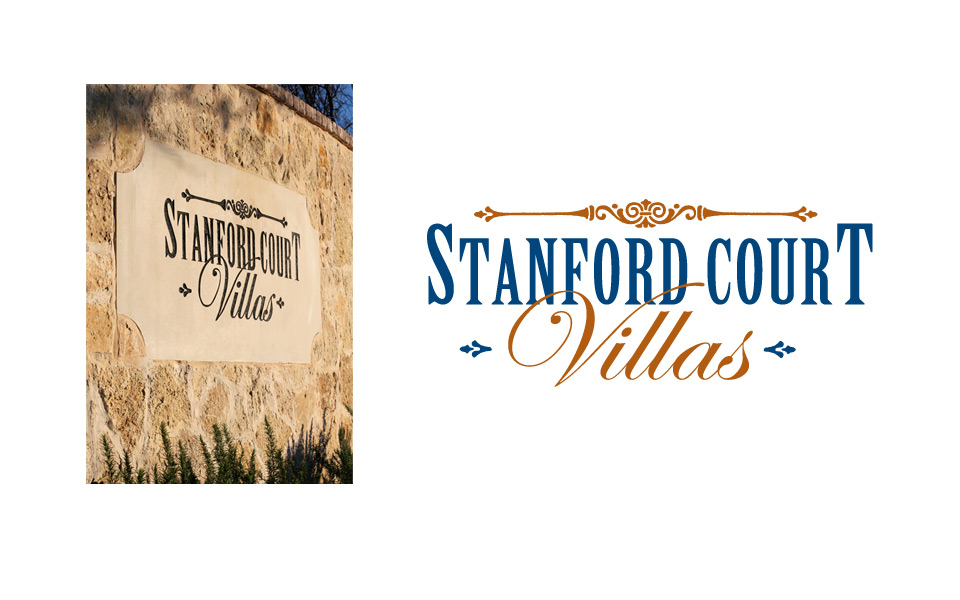
Stanford Court Villas is an exclusive townhome development in Addison, Texas. The architectural style is upscale, but comfortable Italian, so the logo needed to match. For the color palette, we chose a slightly warm blue and a rust; for the type we chose a strong condensed serif face and an elegant script. The decorative header element finishes it off nicely.

When designing this logo (well, really any and all logos) we kept in mind that it would eventually need to work in just one color, so we did all initial design work in black and white to develop our concepts; we then did color studies after the client picked the logo he wanted to use. And sure enough, the one color version translated beautifully into stone for the monument signage at the entrance to the property.
Stanford Court Villas logo with monument
Palm Beach Tan monthly signage campaign

Palm Beach Tan August campaign

Palm Beach Tan highlights monthly specials with a multi-piece campaign: a 28″x28″ square window cling, a 28″x59″ vertical window cling, an 8.5″x11″ point-of-purchase sign and a coupon.

The artwork always carries the PBT brand with colorful photography, the blue, teal and yellow color scheme and the wave shape at the bottom of the art … and some palm branches hidden in there somewhere!

Palm Beach Tan monthly signage campaign