Enclave at Horseshoe Bay ad

Enclave at Horseshoe Bay half-page ad

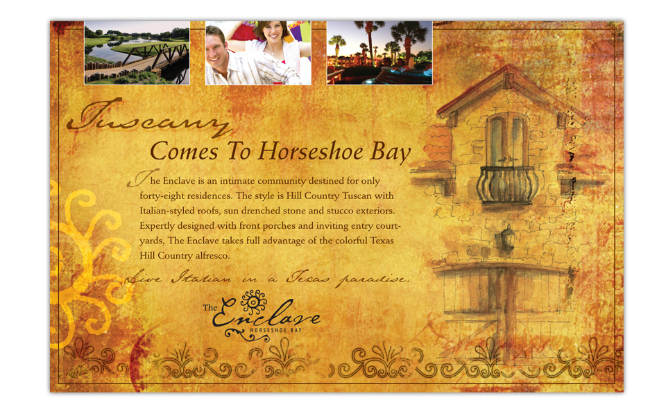
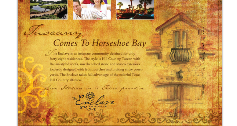
This half-page magazine ad is for The Enclave at Horseshoe Bay, an intimate community of 48 residences in the Texas Hill Country.

We used rich textures and watercolor paintings of architectural details as a backdrop for the copy; then we added lifestyle and landscape photos to give prospects a flavor of Enclave living.

The sun element from the logo is repeated large on the left side to reinforce the Enclave brand.

Since we also designed the Enclave brochure, we kept the ad consistent with the look and feel we established with it.

Enclave at Horseshoe Bay ad

Palm Beach Tan point-of-purchase signs

Palm Beach Tan p-o-p signs

Every month Palm Beach Tan highlights specials with its P-O-P (point of purchase) displays. These are usually 8.5″ x 11″ signs in clear plexiglass holders that sit on the front counter.

The artwork always carries the PBT brand with colorful photography, the blue, teal and yellow color scheme and the wave shape at the bottom of the art … and some palm branches hidden in there somewhere!

Palm Beach Tan point-of-purchase signs

Enclave at Horseshoe Bay brochure

Enclave at Horseshoe Bay brochure

This beautiful brochure is a key marketing piece for The Enclave at Horseshoe Bay, an intimate community of only 48 residences. It gives prospects a flavor of the renowned Horseshoe Bay Resort and the Hill Country Tuscan style of the homes.

From textured paper to water color architectural paintings to classical type treatments and rustic textures, this floorplan brochure represents its development perfectly.

Enclave brochure

Palm Beach Tan monthly signage campaign

Palm Beach Tan April campaign

Palm Beach Tan highlights its monthly specials with a multi-piece campaign: a 28″x28″ square window cling, a 28″x59″ vertical window cling, an 8.5″x11″ point-of-purchase sign and occasionally an outdoor billboard.

The artwork always carries the Palm Beach Tan brand — colorful photography, the blue, teal and yellow color scheme and the wave shape at the bottom of the art … and some palm branches hidden in there somewhere!

Palm Beach Tan monthly signage campaign

Mansions at Stonebridge Ranch - wine labels, postcard, brochure

Mansions at Stonebridge Ranch brochure, wine labels and postcard

These three pieces are key components in marketing upscale apartment homes Mansions at Stonebridge Ranch.

We set the look and feel by designing the 32-page 11″ x 17″ glossy brochure. Then we carried the landscape and statue imagery to the wine labels.

Since the postcards were part of a larger direct mail campaign for several Mansions properties, we designed those to show off more of the lifestyle side of things … in this case golf, since this property is on a golf course.

For the card we combined nature shots, interior domestic details, the logo and tagline with a map and list of amenities to entice prospects to come in for a property tour, the floorplan brochure … and a complimentary bottle of wine with their custom label.

And it all comes full circle!


Mansions at Stonebridge Ranch - wine labels, postcard, brochure

Mansions at Stonebridge Ranch brochure

Mansions at Stonebridge Ranch brochure

This 32-page 11″ x 17″ brochure is a beautiful, over-sized way to market upscale apartment homes.

The photography is a combination of ethereal landscape, classical statues and contemporary lifestyle photos.

The color scheme is very neutral and provides an excellent contrast to the colorful people photos. The typography is very classical and comfortable.

The look of the brochure successfully conveys the feel of the property while showing off its generous floor plans and ample amenities. Who wouldn’t want to live here?

Mansions at Stonebridge Ranch brochure

Ice Cafe logo

Ice Café logo

We enjoyed working with muted textures and colors for a rich logo treatment for Gaylord Texan’s café that accompanied its winter-themed ICE event.

Mansions Woodland brochure

Mansions Woodland brochure

This 32-page 11″ x 17″ brochure is a beautiful, over-sized way to market upscale apartment homes.

The photography is a combination of nature, contemporary lifestyle and domestic details.

The black and jewel-tone color scheme is bold and rich. To add a little quirky touch we brought in a fun, condensed display type in a bright green. It plays well off the traditional Snell Script used in the intro paragraph.

The leafy scroll from the logo becomes a recurring graphic throughout the brochure to reinforce the property’s brand imagery.

The look of the brochure successfully conveys the fun, energetic feel of the property while showing off its homey floor plans and plentiful amenities. Who wouldn’t want to live here?

Mansions Woodland brochure

Mansions by the Lake brochure

Mansions by the Lake brochure

This 32-page 11″ x 17″ brochure is a beautiful, over-sized way to market apartment homes by the lake.

The photography is a combination of care-free lifestyle photos, sailing and lake imagery, and gorgeous nature & architectural details.

The color scheme is deep blue (for the lake, of course!), rich red and warm caramels and chocolates, mmmm.

We chose Heathen script typeface for the headlines because it’s upscale, but not uptight; and it provides extra punch when layered over the artwork underneath.

The look and feel of the brochure successfully conveys the lifestyle of the property, and shows off the large floor plans and lavish amenities. Who wouldn’t want to live here?


Mansions by the Lake brochure

AmerTrans logo

AmerTrans logo

AmerTrans Relocation Services is a Nelson Westerberg company (NW is an Atlas Van Lines agent) that handles all the planning aspects of relocating Fortune 500 companies’ employees across town or across the world.

With a very corporate audience in mind, we designed this logo in traditional red and blue and the conservative serif typeface Trajan (you’ve probably seen this all-caps typeface in movie titles). We integrated an arrow icon for the moving industry and added a flourish to push it in the direction of an abstract A (for AmerTrans, of course!).