Parish Episcopal School annual report and magazine

Parish Episcopal School annual report and magazine

This 60+ page piece doubles as Parish’s seasonal magazine (the Corner) as well as its annual report.

In keeping with their established design style, we used large color blocks to set off colorful photography of school life. The headlines, while set in very classical faces have a fun and friendly rhythm to them.

Professional, but not stodgy — it’s perfect for Parish!

Parish Episcopal School annual report and magazine

Rudy’s Tortillas 65th anniversary logo

Rudy’s Tortillas has been in business since 1945 and wanted to celebrate their 65th anniversary all year long. One way we helped them achieve this was to redesign their existing business cards (which we had already designed) and add a special 65th anniversary logo.

We chose to keep the 65th logo colors consistent with the colors we had established for Rudy’s cards. It’s usually frowned upon to use so many different fonts in one project, but if you’re a typographic ninja you can make it work! We were careful to use three families that are very different from each other, and we used one of them very sparingly. We used Trajan for the “65” (that’s all, folks), then used Shelley Script for the “th” and “Anniversary” while using Rudy’s existing face Avenir for the rest.

Next, the addition of a simple arc of stars suggests movement and celebration. The colors, fonts and shapes balance each other well and are grounded by a simple decorative baseline.

Congrats on 65 years!
Rudy's Tortillas 65th anniversary logo
Deltan Group logo

Deltan Group logo and business package

This project was to redesign a logo for an existing company, Deltan Group. The client wanted an icon to accentuate the letter D and show some movement; he also wanted to use bold, conservative colors. We created an abstract capital D out of a blue arrow shape and a solid red curve with 2 white arcs reversed out of it. Since Deltan offers business computer services in the Windows-verse we chose Franklin Gothic for the logo and contact copy (similar type family to the MS mothership).

We wanted to have a little fun with the business card and carry the theme of movement even further; we added red angles to the right end of the card to let the white negative space become an arrow, with the same angle as the iconic D of the logo.

In addition to the basic letterhead, we designed a shell that Deltan could print company info on in-house and slip into a pocket folder. The shell art repeats the blue arrow from the logo in the left margin and has the D icon blown up larger than life in the background.

Simple, strong, effective.
Deltan Group logo and business package
Boldt invitation

80th birthday party invitation

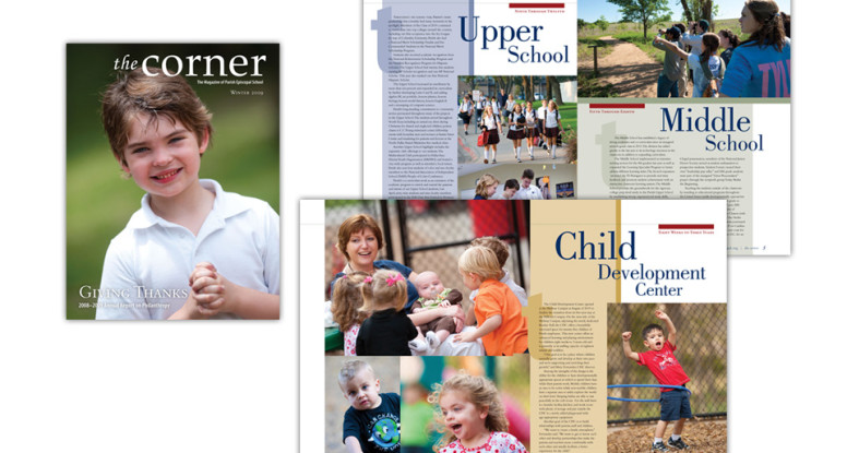
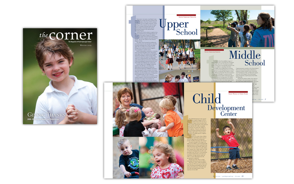
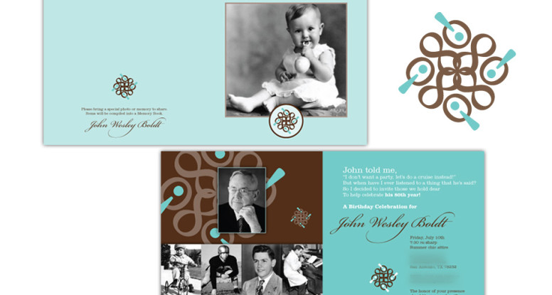
This mission was to design a contemporary and elegant, yet casual invitation to an 80th birthday celebration. The client supplied several photos from the birthday boy’s life, and we went to work!

The first thing we did was to layout the text and photos; we then chose typefaces — Clarendon because it’s a casual, easy-to-read serif face. We offset that with Bickham Script and used some of the alternate characters from that face for additional scripty flair!

Rather than go with a traditional all-centered layout for the text, we staggered two flush left copy blocks … for a contemporary treatment. We chose a soft teal and dark brown for the colors as that’s a very fresh color combo.

And somewhere in the interim whirl of colors and typefaces, we created that stellar 80! icon. No, it’s not clip art. We designed it from scratch just for this project — that little twist of the unexpected. We used Filosofia typeface for its clean and friendly characteristics.

The client loved the invitation and the 80! mark so much that she had party napkins custom printed with the mark. What a fun & rewarding project this was!
Boldt invitation
Yard signs honoring military members

Yard signs honoring past and present military

This project was to design a full suite of 18″ x 24″ vibrant metal signs for families of military members to display in their yards.

We wanted to give the artwork a strong patriotic look without showing a literal flag. We found and customized a bold red and blue illustration and set the white text in a bold sans-serif typeface with a soft black glow to further pop the text off the art.

The art is very eye-catching and shows off the stars and stripes beautifully. We designed signs for each branch of the military; the red background is for vets and the blue background is for current members.

Yard signs honoring military members

TJ’s sign and ad

TJ’s Seafood Market sign and magazine ad

We designed these two pieces for TJ’s Seafood Market.

The one on the left is in-store signage to remind people that TJ’s has a lot more than seafood; they do catering, serve sandwiches, salads, cheese platters, desserts, etc. We kept the copy very brief so we could devote the bulk of the messaging to the branding and the photos. Sure, it’s seafood … plus all these other tasty treats!

The piece on the right was a 1/6 page ad for D Magazine’s holiday issue. One dominant photo, a headline and contact info gets the point across — simply and elegantly.

TJ’s sign and ad

Riney Palter logo

Riney Palter business package

We chose traditional (but certainly not stodgy!) colors and typefaces for this logo because it’s for a law firm. We worked a subtle star element into the logo; in replacing two quadrants of the star with letter blocks, the partial star doubles as an arrow adding some motion to the icon.

Riney Palter business package

Normandy Estates full page ad

Normandy Estates full-page ad

We designed this full-page ad for placement in D Home Magazine to announce that Zachary Custom Builders was accepting home site reservations in Normandy Estates, a new gated community in Plano, Texas.

To keep a consistent look with other ZCB marketing materials, we used a large beautiful home photo front and center; the logo is large and the type is minimal; we finished it off with D Home seals and a sprinkling of upscale lifestyle and interior photos across the bottom.

Normandy Estates full page ad

In Your Own Kitchen cook book

In Your Own Kitchen cook book

This fun project was a 200+ page cook book written by a chef/cooking teacher.

Each section of the book has a different color theme starting with blue for breakfast. We designed the typography to be easy to read and follow at a distance. We supplemented custom photography with royalty-free, and the final piece is gorgeous — without breaking the bank.

In Your Own Kitchen cook book

Dr. Boldt endowment brochure

Dr. Boldt endowment brochure

This brochure is the official announcement and fundraising kick-off for an endowed chair in gynecological surgery in honor of Dr. John Boldt at The University of Texas Health Science Center at San Antonio.

The design mission called for the layout, color scheme and typography to be a little festive (to celebrate a career) and a little serious (to launch a fundraising effort). We accomplished this with shades of blue and brown, layered typography in an upscale script & a classical serif typeface and some subtle, well-places typographic embellishments.

Dr. Boldt endowment brochure