Imlach & Collins Brothers logo
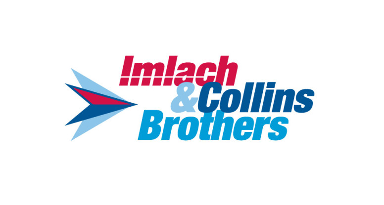
Since Imach & Collins is an Atlas Van Lines agent, they wanted their logo to have a little flavor of the Atlas logo.
We used similar colors (one strong red and some friendly blues) with a traditional Helvetica Extra Bold Condensed typeface; the arrangement of the words, the white line through Imlach and the arrow heads add motion to the mark while maintaining a strong balance.
The layout of the words is reflected in the shape of the arrow — pointing to the right, moving forward, as any good moving company should do.
Move along!