TJ’s sign and ad

TJ’s Seafood Market sign and magazine ad

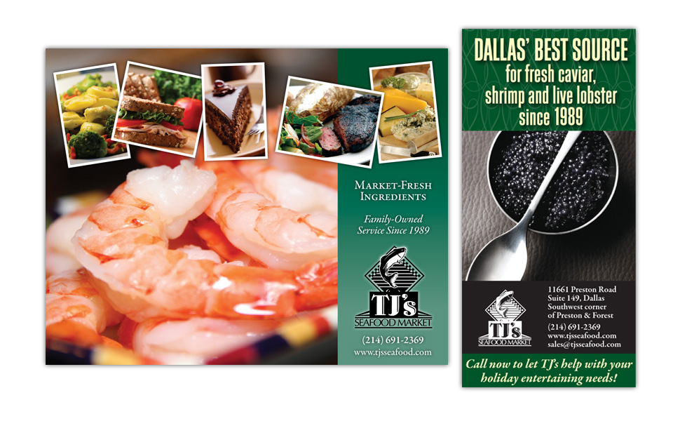
We designed these two pieces for TJ’s Seafood Market.

The one on the left is in-store signage to remind people that TJ’s has a lot more than seafood; they do catering, serve sandwiches, salads, cheese platters, desserts, etc. We kept the copy very brief so we could devote the bulk of the messaging to the branding and the photos. Sure, it’s seafood … plus all these other tasty treats!

The piece on the right was a 1/6 page ad for D Magazine’s holiday issue. One dominant photo, a headline and contact info gets the point across — simply and elegantly.

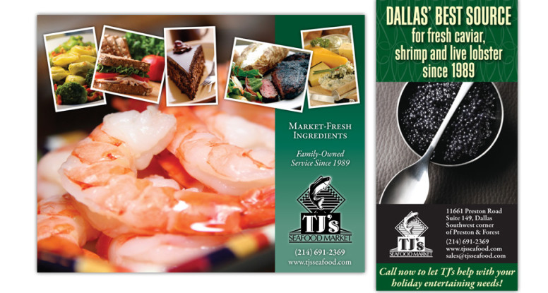
TJ’s sign and ad

Riney Palter logo

Riney Palter business package

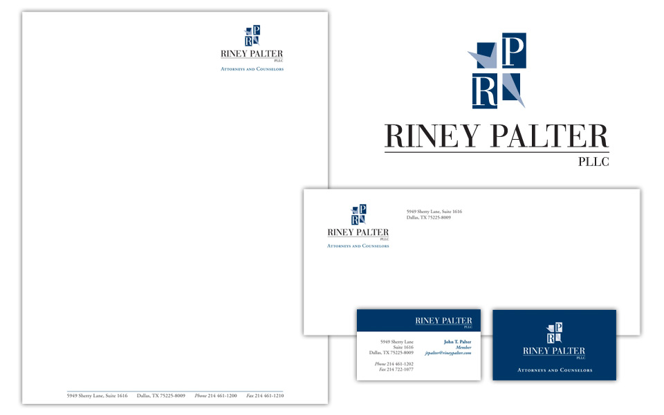
We chose traditional (but certainly not stodgy!) colors and typefaces for this logo because it’s for a law firm. We worked a subtle star element into the logo; in replacing two quadrants of the star with letter blocks, the partial star doubles as an arrow adding some motion to the icon.

Riney Palter business package

Normandy Estates full page ad

Normandy Estates full-page ad

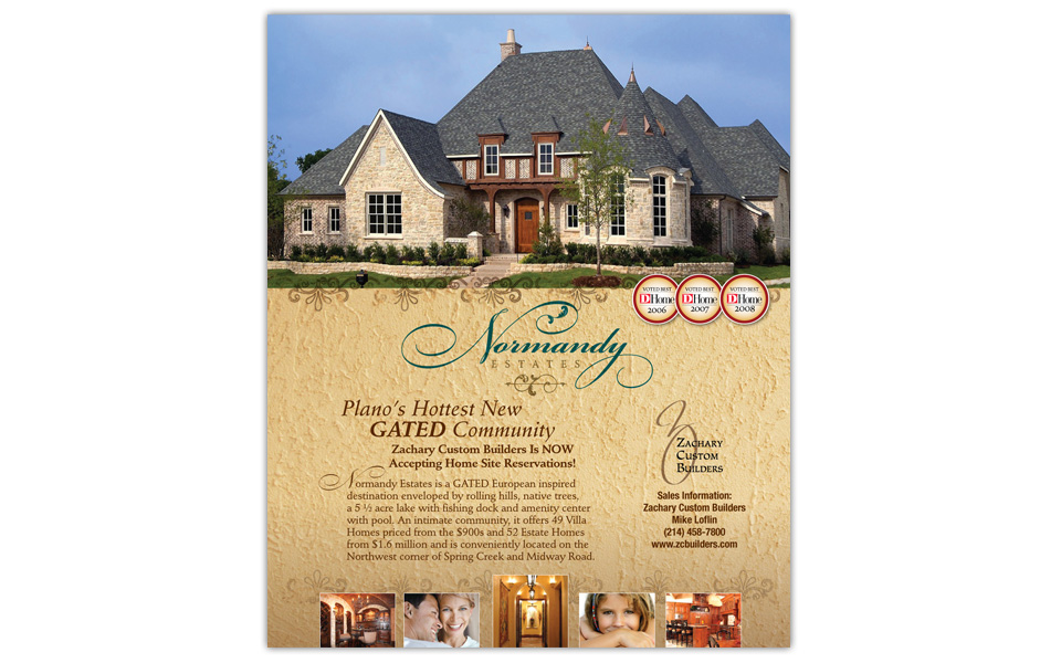
We designed this full-page ad for placement in D Home Magazine to announce that Zachary Custom Builders was accepting home site reservations in Normandy Estates, a new gated community in Plano, Texas.

To keep a consistent look with other ZCB marketing materials, we used a large beautiful home photo front and center; the logo is large and the type is minimal; we finished it off with D Home seals and a sprinkling of upscale lifestyle and interior photos across the bottom.

Normandy Estates full page ad

In Your Own Kitchen cook book

In Your Own Kitchen cook book

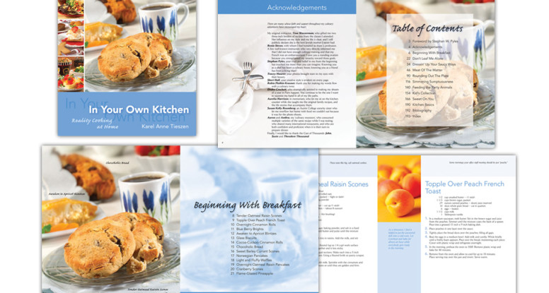
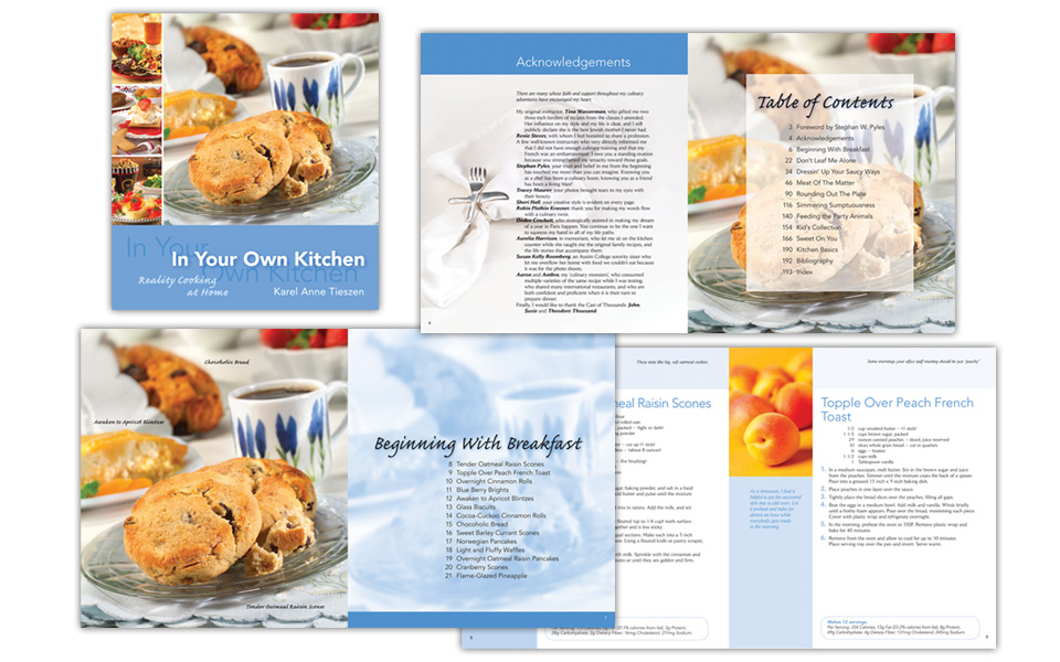
This fun project was a 200+ page cook book written by a chef/cooking teacher.

Each section of the book has a different color theme starting with blue for breakfast. We designed the typography to be easy to read and follow at a distance. We supplemented custom photography with royalty-free, and the final piece is gorgeous — without breaking the bank.

In Your Own Kitchen cook book

Dr. Boldt endowment brochure

Dr. Boldt endowment brochure

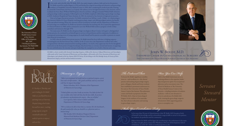
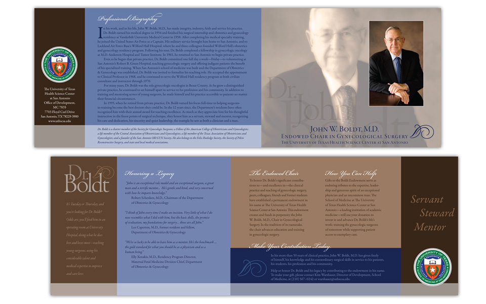
This brochure is the official announcement and fundraising kick-off for an endowed chair in gynecological surgery in honor of Dr. John Boldt at The University of Texas Health Science Center at San Antonio.

The design mission called for the layout, color scheme and typography to be a little festive (to celebrate a career) and a little serious (to launch a fundraising effort). We accomplished this with shades of blue and brown, layered typography in an upscale script & a classical serif typeface and some subtle, well-places typographic embellishments.

Dr. Boldt endowment brochure