Halloween party invitations - email, poster, flyer

Halloween party invitation – email, poster, flyer

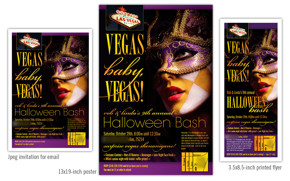
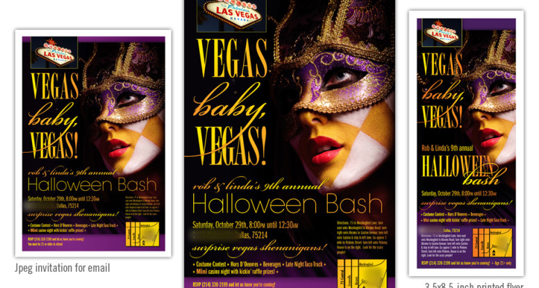
These pieces are invitations to a Halloween party. We started by designing the poster with the “Vegas Baby, Vegas” theme.

After the poster art was finished, we moved on to the small printed flyer. Although still vertical, the proportion is very different and required significant layout changes to keep the same look and feel while making sure the information was large and readable.

Lastly we went back to the poster art, shrunk it a bit and nudged things around to fit 8.5″x11″ and exported to jpeg for email purposes.

Although all three of these invitation avenues are very different, we maintained the same dramatic photo and typography look across all of them.


Halloween party invitations - email, poster, flyer

Jeng Chi menu, web site and photography

Jeng Chi menu, website and photography

This project started out as a website redesign, and quickly grew into a menu redesign as well. Since some of the menu offerings and pricing was set to change, it was the perfect time to update the look as well.

We set aside an afternoon to visit Jeng Chi and photograph several dishes that they wanted to highlight on their menu and site. Since the restaurant has some nice architectural and decor pieces we shot them as well, knowing they would be nice to use as background elements for web headers and print work.

We used the round shape of a dramatic interior doorway of the restaurant as a recurring shape on the menu cover and website header. We kept the menu cover fairly simple and emphasized the branding with colors, typography and the Jeng Chi name and characters.

For the inside of the menu we kept the layout clean — three columns with easy-to-read type overlaying a background photo highlighting an item from that page.

The website homepage hosts a photo slider showing off Jeng Chi’s most popular offerings. The online menu, map and hours were the other items the client wanted emphasized on the new site.

The new photography and branding gives Jeng Chi a much needed update; the strong, classy look and feel now match its tasty food.


Jeng Chi menu, web site and photography

Diploma Sender logo

Diploma Sender logo and business package

Diploma Sender is an internet-based service that manages GED testing data and delivers required documents to its test-taker customers. Since they are dealing with people in the education field, they wanted a strong, yet accessible mark for their company.

We chose a dominant “D” and wove a couple decorative elements through it to show motion (for the sending part, of course).

We chose a slab serif typeface since it is friendly and easy to read.

On the letterhead, we placed the logo top right, flush with the right margin of the letters printed to come. The wave element is repeated large and light at the bottom. The business card is designed to match, but the gold is a little stronger to stand out and attract attention, as any good  business card should do.

We also created a seal graphic for their web site to highlight an essay writing contest. It’s friendly, yet official and adds some new curves to the mix.

Diploma Sender logo and package

Spring Party logo

Spring Party logo

We created this charming logo for The Learning Tree, a small private school in Dallas. They throw an annual fundraiser in the springtime and needed a logo for signage and event materials.

The event planners wanted a rustic and friendly logo that included a cowboy on a horse under a tree to complement the western flavor of the venue and catering.

We customized a silhouette cowboy illustration and combined it with a colorful type treatment; the script is appropriately named Giddyup  and resembles a rope-drawn typeface. The condensed face is Birch and fits well nestled under the “g” and “y” above.

A spring party logo calls for some color! Combining red, orange and alternating greens for the type treatment gives the silhouette some much-needed pop.

Quest Recycling Services diagrams

Quest Recycling diagrams

Quest provides recycling services to businesses and needed a series of diagrams to illustrate how they process various items — glass, plastic, organic food, oil, tires, electronic waste, etc.

There are 20 diagrams in the series; each has a graphic representation of the process as well as a brief text description. The style is friendly and simple; the information is thorough. And of course there’s a lot of green!

Quest Recycling Services diagrams