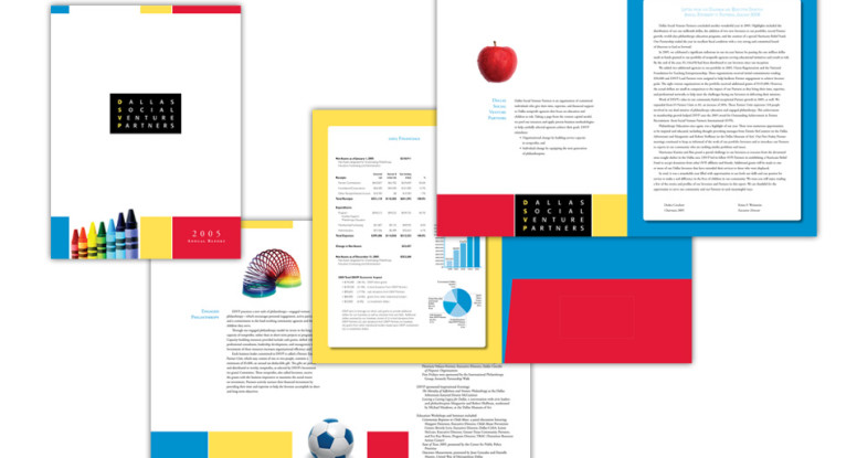
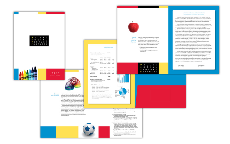
This is quite the multi-tasking piece! The directive was to design it to be part brochure, part annual report and part pocket folder — all in 12 pages.
Since the client’s mission is to invest resources into kid-friendly non-profit organizations, they wanted their annual report to incorporate child-related icons without showing specific children.
They also wanted a very clean, simple look. To achieve that we used a lot of white space (or what we designers call negative space), blocks of primary colors, and classical typography like one mind find in a school book.
Mission accomplished — fresh, colorful, friendly and easy on the eyes.


