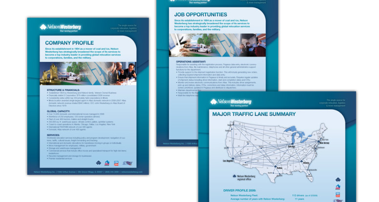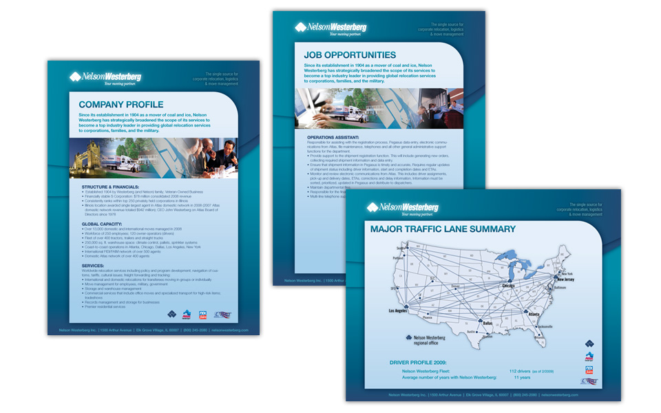
Nelson Westerberg series of flyers
We designed this series of one-page brochures for Nelson Westerberg, an Atlas Van Lines agent (they’ll really move you!).
These flyers do double duty: they can be printed and used as folder inserts and they can be emailed as PDFs to prospects and clients.
Since Nelson Westerberg’s logo colors are similar to Atlas (red and blues), we chose to play that up with the background shapes and create some nice curves and gradations to set off the information and become a recurring way to brand all the pieces similarly.
The text is the very clean and readable Helvetica Neue.
A colorful, but blue-heavy row of gradated photos rounds out the layout while nicely supporting the brand.

