Mansions Woodland brochure

Mansions Woodland brochure

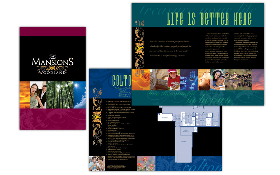
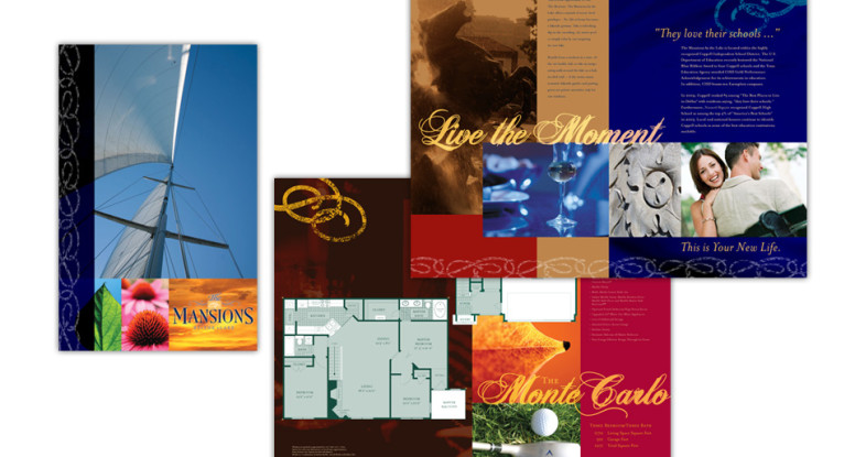
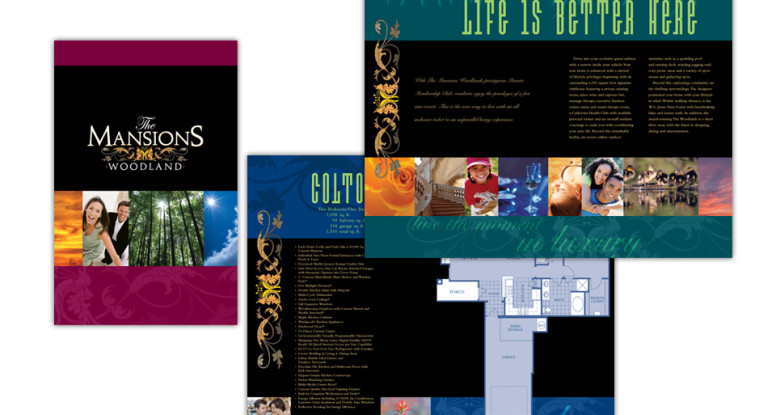
This 32-page 11″ x 17″ brochure is a beautiful, over-sized way to market upscale apartment homes.

The photography is a combination of nature, contemporary lifestyle and domestic details.

The black and jewel-tone color scheme is bold and rich. To add a little quirky touch we brought in a fun, condensed display type in a bright green. It plays well off the traditional Snell Script used in the intro paragraph.

The leafy scroll from the logo becomes a recurring graphic throughout the brochure to reinforce the property’s brand imagery.

The look of the brochure successfully conveys the fun, energetic feel of the property while showing off its homey floor plans and plentiful amenities. Who wouldn’t want to live here?

Mansions Woodland brochure

Mansions by the Lake brochure

Mansions by the Lake brochure

This 32-page 11″ x 17″ brochure is a beautiful, over-sized way to market apartment homes by the lake.

The photography is a combination of care-free lifestyle photos, sailing and lake imagery, and gorgeous nature & architectural details.

The color scheme is deep blue (for the lake, of course!), rich red and warm caramels and chocolates, mmmm.

We chose Heathen script typeface for the headlines because it’s upscale, but not uptight; and it provides extra punch when layered over the artwork underneath.

The look and feel of the brochure successfully conveys the lifestyle of the property, and shows off the large floor plans and lavish amenities. Who wouldn’t want to live here?


Mansions by the Lake brochure

DSVP annual report

DSVP annual report

This is quite the multi-tasking piece! The directive was to design it to be part brochure, part annual report and part pocket folder — all in 12 pages.

Since the client’s mission is to invest resources into kid-friendly non-profit organizations, they wanted their annual report to incorporate child-related icons without showing specific children.

They also wanted a very clean, simple look. To achieve that we used a lot of white space (or what we designers call negative space), blocks of primary colors, and classical typography like one mind find in a school book.

Mission accomplished — fresh, colorful, friendly and easy on the eyes.

DSVP Annual Report