Mira Vista Ranch brochure and card

Mira Vista Ranch brochure and card

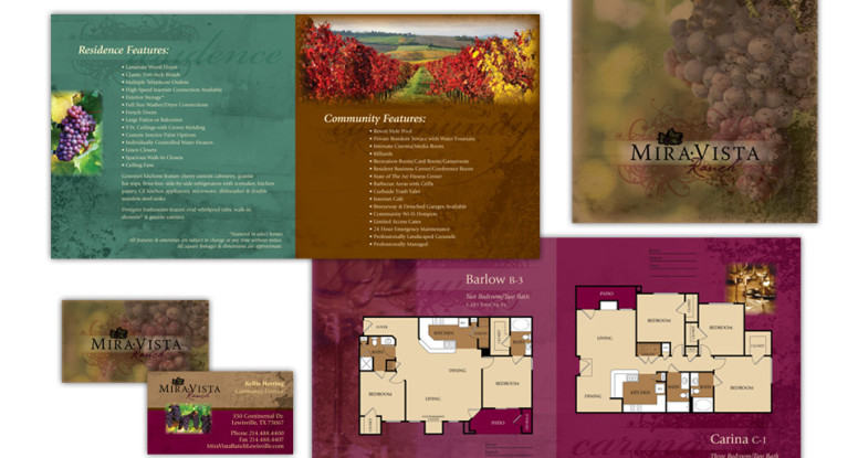
Located in Lewisville, Texas, the Mira Vista Ranch apartment homes development was inspired by Napa Valley and its rich heritage of winemaking.

We designed the brochure and card to match — deep, rich colors, inviting photography, multi-layered, textured backgrounds, upscale script and serif typefaces all come together to provide a strong background for floorplans and community details.

Mira Vista brochure and card

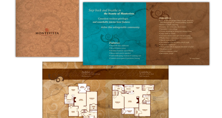
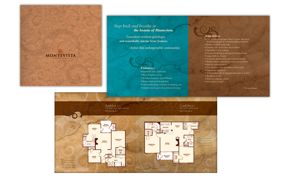
Montevista Apartment Homes brochure

Montevista Apartment Homes borchure

Located in Fort Worth, Texas, Montevista is a sanctuary from an otherwise frantic world where sun drenched terra cotta terraces, tranquil fountains and Spanish-inspired structures are bathed in rich vanilla skies.

We designed the brochure to mirror the feel of the development  — with colors of warm rust and cool teal, rich, textured backgrounds, a casual script and elegant serif typeface all come together to provide a strong background for floorplans and community details.

Montevista Apartment Homes brochure

Evolv brochure

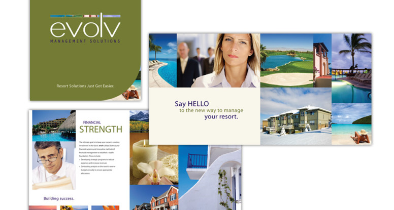
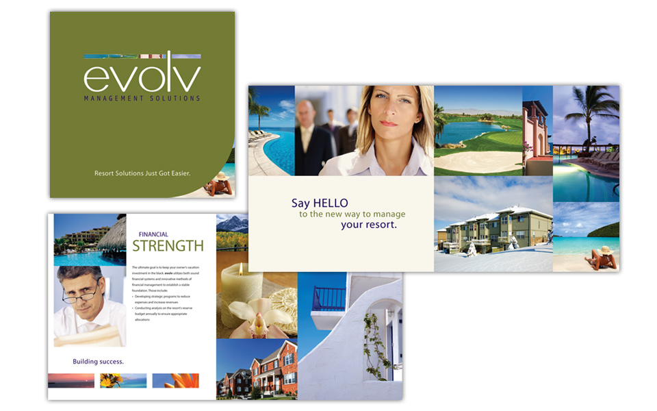
Evolv Management Solutions brochure

This brochure for evolv, a resort management company, incorporates a wide variety of inviting resort photography to show off its message of innovative management, operations experience, professional customer service and HOA management offerings.

We kept the typography very clean and simple and used recurring blocks of three extreme horizontal photos to echo the bars over the letters in the logo.

Evolv brochure

Lone Star Furnishings logo

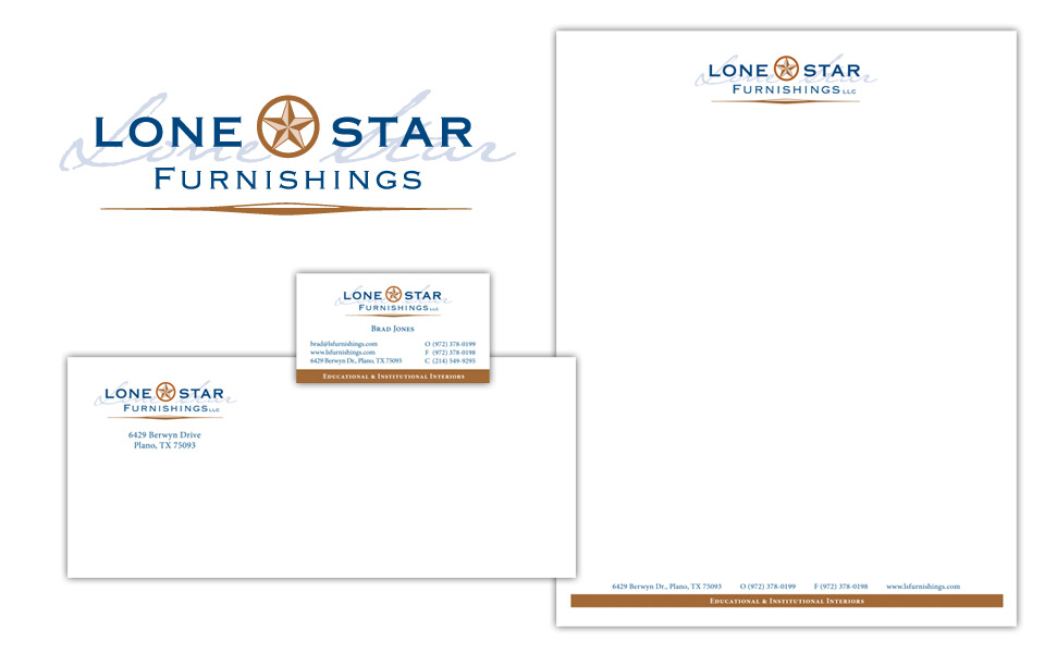
Lone Star Furnishings business package

We designed this logo and business package for a client who was looking for something a little rustic yet strong and conservative. The copper is a metallic ink and the star is embossed on print applications.

Lone Star Furnishings business package

Southwest Women's Business Works! logo

Southwest Women’s BusinessWorks! logo

We designed this logo for a conference and trade show for the Women’s Business Council Southwest. They needed something strong, but not flashy and not overly feminine. We went with a text treatment only — no graphics; as you can tell, just because there aren’t any graphics doesn’t mean a logo has to be bo-ring. We varied which letters were upper case and which were lower to achieve an attractive and interesting balance. It’s a little like putting a puzzle together — but we get to create our own pieces! We chose to eliminate the dot over the i in business because it wasn’t necessary for readability (our brains are amazing at filling in the blanks in cases like this), and would have interfered with the text above.

We like the choice of Mrs Eaves type family since it has a nice delicate quality to its serfis (the feet at the end of the characters) and has a flowing italic, but doesn’t scream lipstick. (This is also the typeface the WBCS organization uses for its logo, so it made even more sense for consistency reasons.)  The black, gray and red color scheme work to ground and strengthen the logo.

In a word, it works!