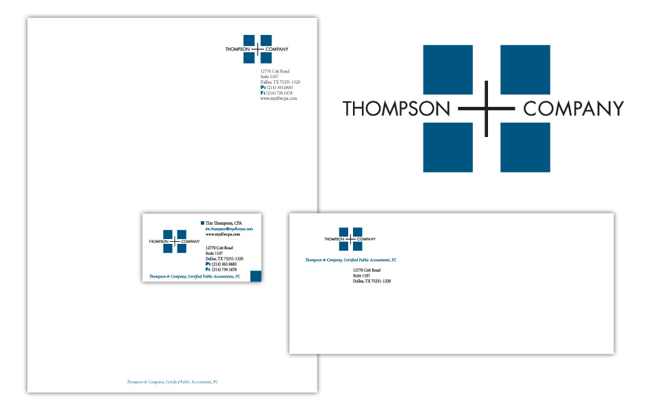
Since this logo design project was for an accounting firm, it needed to be conservative and corporate, but a little contemporary. The layout is symmetrical (balanced like a balance sheet should be!) and the shape of the black plus is echoed in the negative space (white space) between the blue squares.
We chose Futura in all caps for the type treatment since Futura is the little black dress of the typeface world; it can go anywhere at any time and look stylish. It might surprise most folks to know that Futura was designed in the ’20s—the 1920s!
We carried the boxy feel over to the business package and used the blue square as a recurring element on the card.