Riney Palter business package
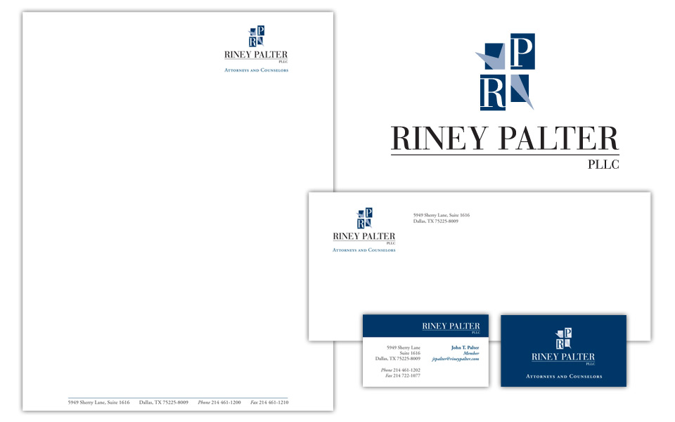
We chose traditional (but certainly not stodgy!) colors and typefaces for this logo because it’s for a law firm. We worked a subtle star element into the logo; in replacing two quadrants of the star with letter blocks, the partial star doubles as an arrow adding some motion to the icon.