Doc Design logo and card
Doc Design was created to offer turnkey office set-up services to health care providers — anything from web design to office furniture and phone systems.
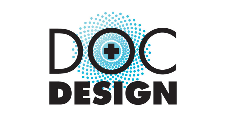
The logo type consists of two weights of Futura: the top is larger and lighter; the bottom is smaller and bolder so they both line up nicely as a block element.
The center of the “O” became the perfect place to add a cross icon and radiate out from it a pattern of circles, representing all of Doc Design’s services coming from one source.
The two-sided business card has a nice clean layout with a white background on the front and a blue background with list of services on the back. The gradation circle pattern is faintly echoed in the top left corner.
It’s amazing what you can do with two colors … if you know what you’re doing!
