Mateo’s banner, product sheet and photography

Mateo’s banner, product sheet and photography

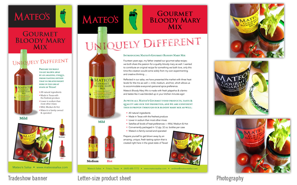
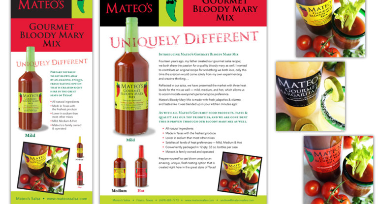
Mateo’s had an existing logo and label design, but had not yet established a look and feel for their print marketing when we stepped into the picture. Most of their sales are to restaurants and retail, so we knew we had to appeal to the business market more than the consumer market.

Our first mission was to photograph the product — bottles only (to show packaging) and product in use (to reinforce the end user’s viewpoint).

Next we designed a product sheet that reflected the colors and Trajan typeface from the logo; we emphasized the “Uniquely Different” tagline by running it over the product photo, putting it on an angle and giving it a rustic texture.

We set the type in two contrasting faces (one serif and one sans-serif) and highlighted part of the the copy with green small caps.

We set the contact info in a green bar at the bottom to draw attention to it. To finish out the layout we added a bold photo of the product in use.

Once we established a look it was easy to create a 7′ tall banner for a tradeshow banner by rearranging and resizing the pieces to fit the new proportion. Although the size is dramatically different, the branding is very consistent.

Mateo’s banner, product sheet and photography

Halloween party invitations - email, poster, flyer

Halloween party invitation – email, poster, flyer

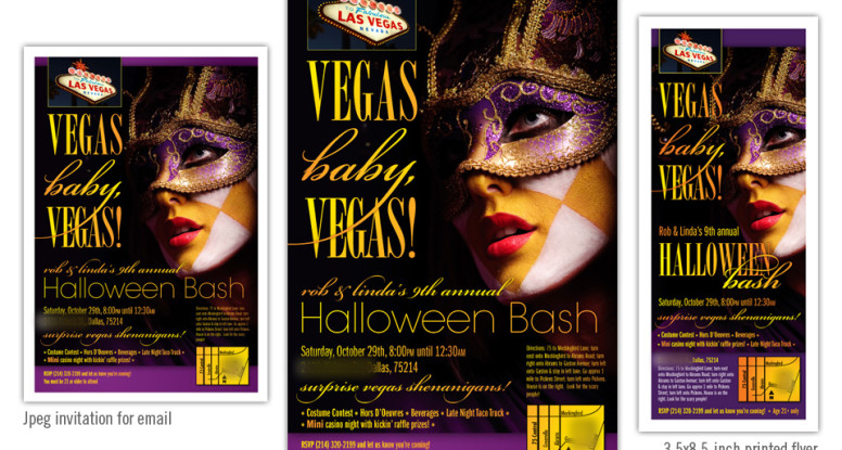
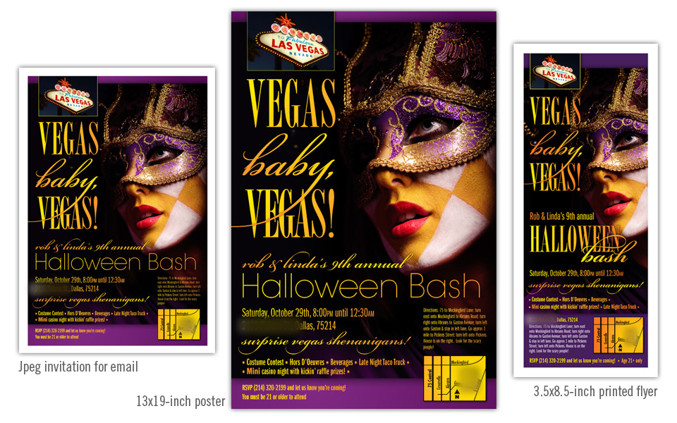
These pieces are invitations to a Halloween party. We started by designing the poster with the “Vegas Baby, Vegas” theme.

After the poster art was finished, we moved on to the small printed flyer. Although still vertical, the proportion is very different and required significant layout changes to keep the same look and feel while making sure the information was large and readable.

Lastly we went back to the poster art, shrunk it a bit and nudged things around to fit 8.5″x11″ and exported to jpeg for email purposes.

Although all three of these invitation avenues are very different, we maintained the same dramatic photo and typography look across all of them.


Halloween party invitations - email, poster, flyer

Jeng Chi menu, web site and photography

Jeng Chi menu, website and photography

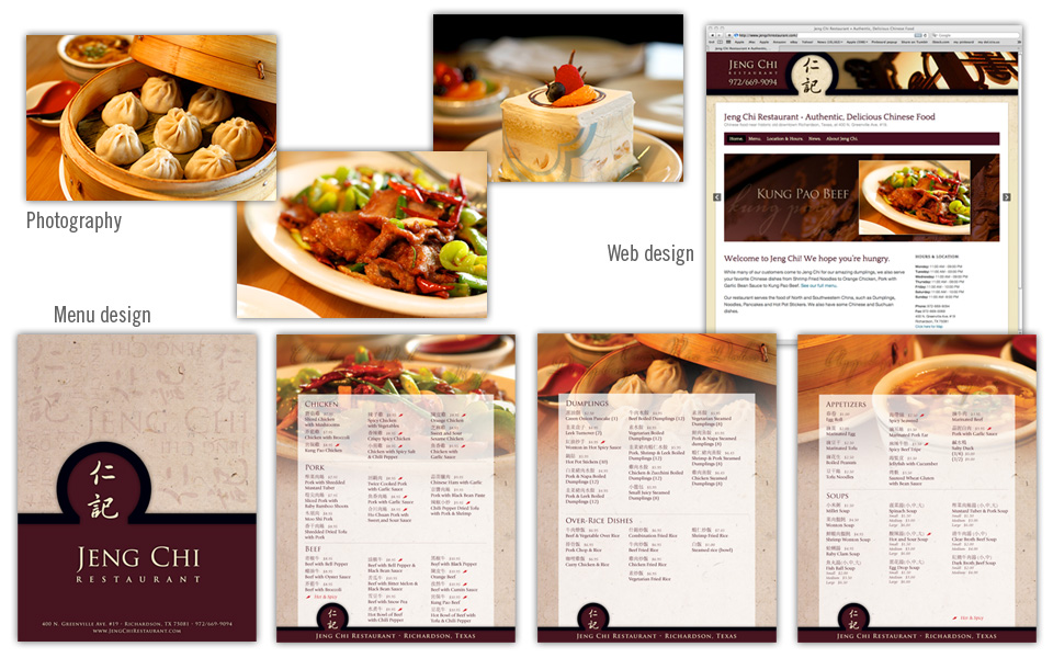
This project started out as a website redesign, and quickly grew into a menu redesign as well. Since some of the menu offerings and pricing was set to change, it was the perfect time to update the look as well.

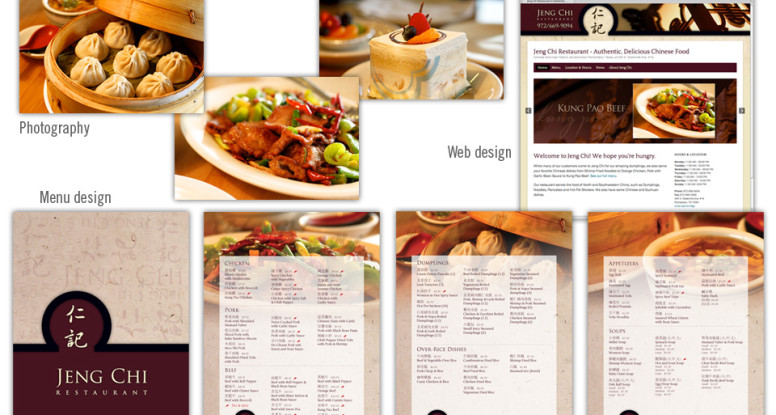
We set aside an afternoon to visit Jeng Chi and photograph several dishes that they wanted to highlight on their menu and site. Since the restaurant has some nice architectural and decor pieces we shot them as well, knowing they would be nice to use as background elements for web headers and print work.

We used the round shape of a dramatic interior doorway of the restaurant as a recurring shape on the menu cover and website header. We kept the menu cover fairly simple and emphasized the branding with colors, typography and the Jeng Chi name and characters.

For the inside of the menu we kept the layout clean — three columns with easy-to-read type overlaying a background photo highlighting an item from that page.

The website homepage hosts a photo slider showing off Jeng Chi’s most popular offerings. The online menu, map and hours were the other items the client wanted emphasized on the new site.

The new photography and branding gives Jeng Chi a much needed update; the strong, classy look and feel now match its tasty food.


Jeng Chi menu, web site and photography

Guardian Association Management logo, website, flyer

Guardian logo, website and flyer

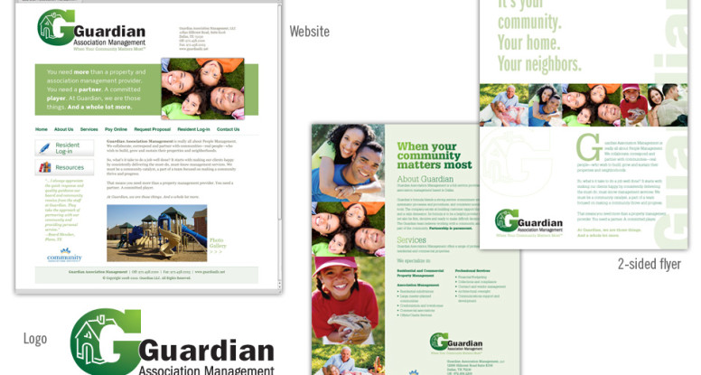
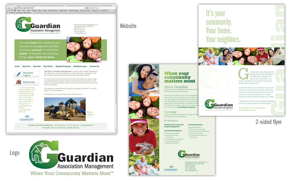
This project includes all the basics a new company needs: a logo, a simple website and a one-page printed flyer that doubles as an emailable PDF.

We started with the logo design (we always start with the logo design as it sets the look and feel for everything that follows!); because the client was on an accelerated schedule to launch their business, we designed the website and flyer concurrently.

The green & green color scheme and the typeface choices we made for the logo influenced the colors and type on the other pieces.

We chose several happy people photos (royalty-free) and built a small library of photography to use on all Guardian work to achieve a consistent look.

Everything works well together and shows off the clean, professional and friendly look of the Guardian brand.

Ta-da!

Guardian Association Management logo, website, flyer

Palm Beach Tan monthly signage campaign

Palm Beach Tan August campaign

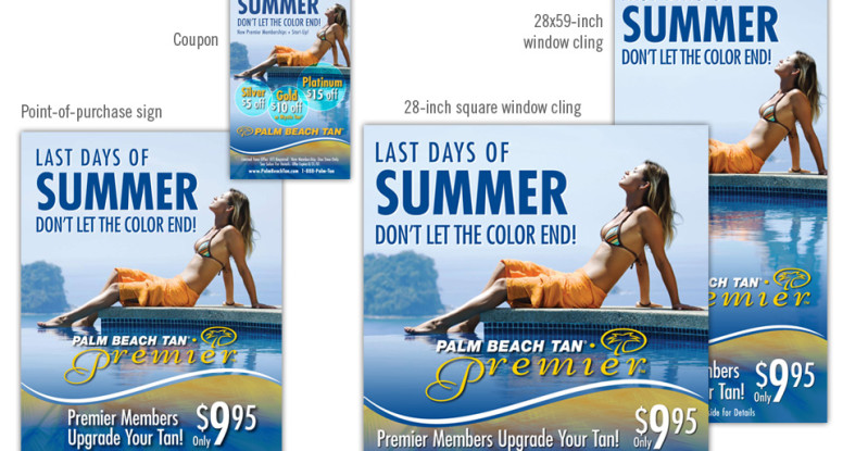
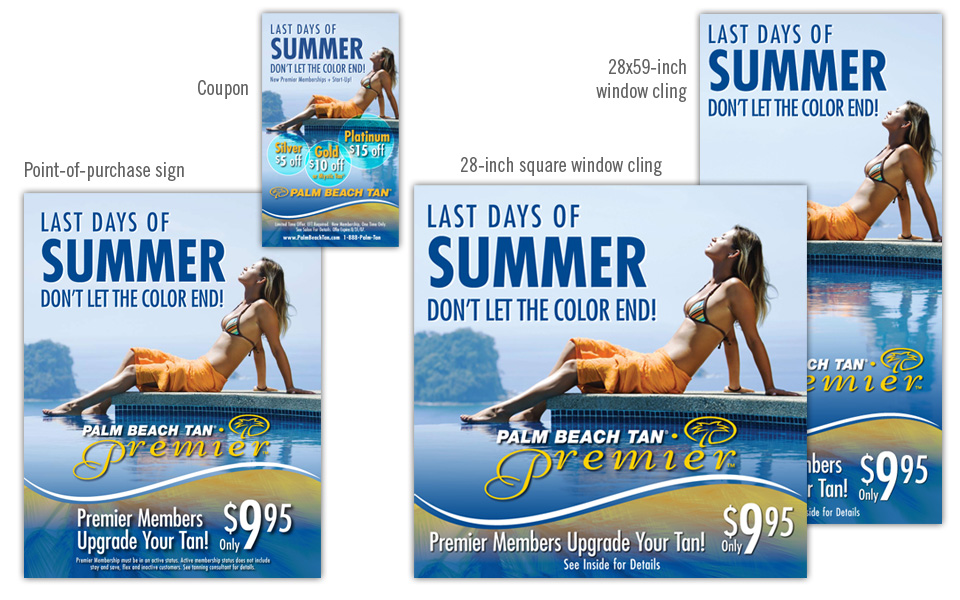
Palm Beach Tan highlights monthly specials with a multi-piece campaign: a 28″x28″ square window cling, a 28″x59″ vertical window cling, an 8.5″x11″ point-of-purchase sign and a coupon.

The artwork always carries the PBT brand with colorful photography, the blue, teal and yellow color scheme and the wave shape at the bottom of the art … and some palm branches hidden in there somewhere!

Palm Beach Tan monthly signage campaign