What a fun project this was! We got to design a logo for a small travel agency (yes, they still have those!) created by two lovely South African ladies. Both specialize in creating amazing, unique travel adventures in their home country and other parts of Africa — especially safaris!
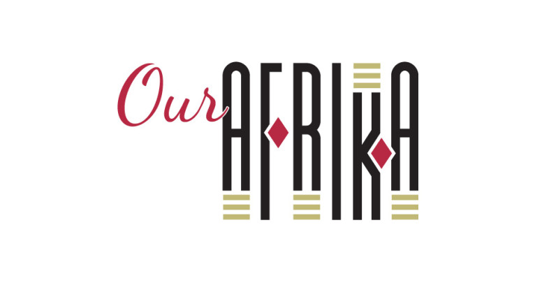
We researched traditional African colors and patterns and chose some simple graphic shapes to accent the typographic logo. We replaced the crossbar of the “F” with a diamond and mimicked the shape of the “K” with another.
Then we manually adjusted the letter heights and added the three khaki blocks above and below certain characters to create a pleasing rhythm.
We set “Our” in a nice friendly script, painted it red and outlined it with a stroke of white to pop it off the black “A” to complete the logo. We chose a black, red and khaki color scheme since it’s earthy and vibrant, just like Africa.
Rooooaaaar!

