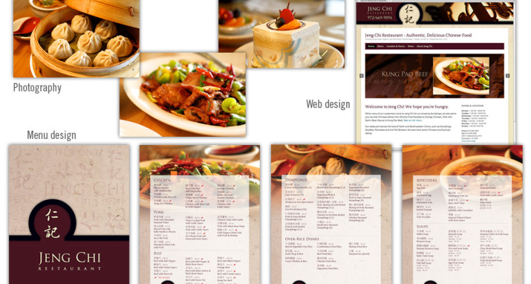
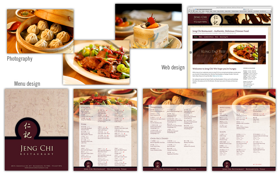
This project started out as a website redesign, and quickly grew into a menu redesign as well. Since some of the menu offerings and pricing was set to change, it was the perfect time to update the look as well.
We set aside an afternoon to visit Jeng Chi and photograph several dishes that they wanted to highlight on their menu and site. Since the restaurant has some nice architectural and decor pieces we shot them as well, knowing they would be nice to use as background elements for web headers and print work.
We used the round shape of a dramatic interior doorway of the restaurant as a recurring shape on the menu cover and website header. We kept the menu cover fairly simple and emphasized the branding with colors, typography and the Jeng Chi name and characters.
For the inside of the menu we kept the layout clean — three columns with easy-to-read type overlaying a background photo highlighting an item from that page.
The website homepage hosts a photo slider showing off Jeng Chi’s most popular offerings. The online menu, map and hours were the other items the client wanted emphasized on the new site.
The new photography and branding gives Jeng Chi a much needed update; the strong, classy look and feel now match its tasty food.


