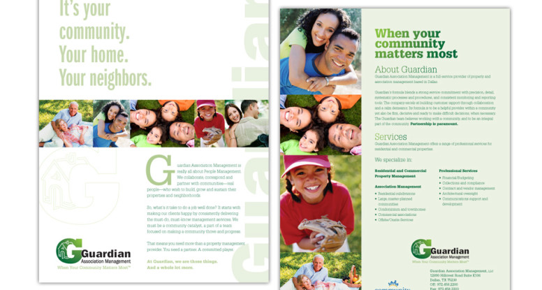
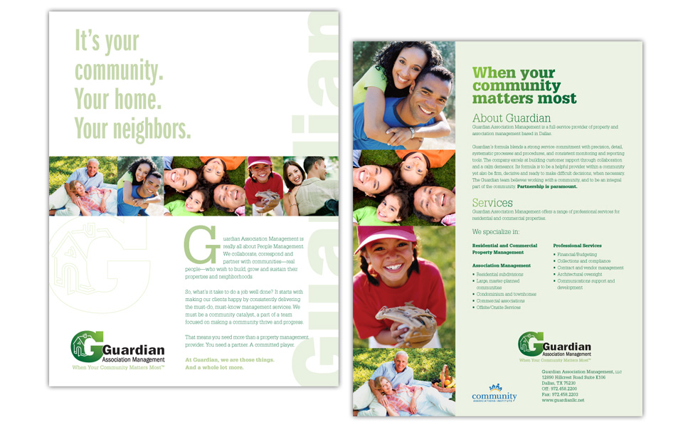
Every new company needs a logo and flyer to launch its marketing efforts. After we designed the Guardian logo, we turned to a full-color flyer.
Since they are marketing their management services to HOAs, we knew the design needed to be professional, yet friendly.
The front side is very clean with a lot of white space, large headline, colorful row of happy people photos, minimal text and a large logo. We also ran the company name up the right side to reinforce it and help establish name recognition.
The back side has info about their services and how to reach them.
Community is important to them — and showing off their strengths is important to us.


