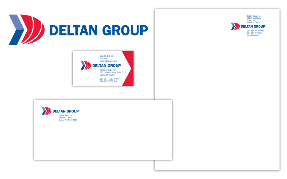
This project was to redesign a logo for an existing company, Deltan Group. The client wanted an icon to accentuate the letter D and show some movement; he also wanted to use bold, conservative colors. We created an abstract capital D out of a blue arrow shape and a solid red curve with 2 white arcs reversed out of it. Since Deltan offers business computer services in the Windows-verse we chose Franklin Gothic for the logo and contact copy (similar type family to the MS mothership).
We wanted to have a little fun with the business card and carry the theme of movement even further; we added red angles to the right end of the card to let the white negative space become an arrow, with the same angle as the iconic D of the logo.
In addition to the basic letterhead, we designed a shell that Deltan could print company info on in-house and slip into a pocket folder. The shell art repeats the blue arrow from the logo in the left margin and has the D icon blown up larger than life in the background.


