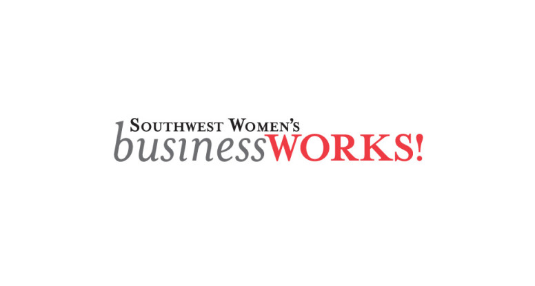
We designed this logo for a conference and trade show for the Women’s Business Council Southwest. They needed something strong, but not flashy and not overly feminine. We went with a text treatment only — no graphics; as you can tell, just because there aren’t any graphics doesn’t mean a logo has to be bo-ring. We varied which letters were upper case and which were lower to achieve an attractive and interesting balance. It’s a little like putting a puzzle together — but we get to create our own pieces! We chose to eliminate the dot over the i in business because it wasn’t necessary for readability (our brains are amazing at filling in the blanks in cases like this), and would have interfered with the text above.
We like the choice of Mrs Eaves type family since it has a nice delicate quality to its serfis (the feet at the end of the characters) and has a flowing italic, but doesn’t scream lipstick. (This is also the typeface the WBCS organization uses for its logo, so it made even more sense for consistency reasons.) The black, gray and red color scheme work to ground and strengthen the logo.

