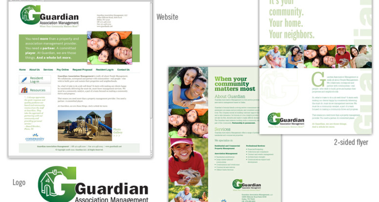
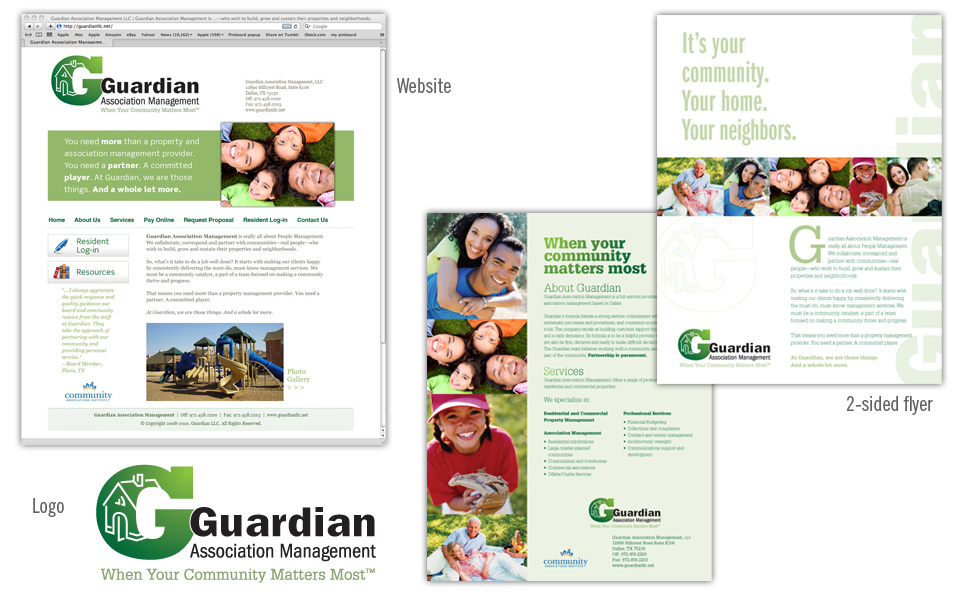
Guardian Association Management logo, website, flyer

Guardian logo, website and flyer

This project includes all the basics a new company needs: a logo, a simple website and a one-page printed flyer that doubles as an emailable PDF.

We started with the logo design (we always start with the logo design as it sets the look and feel for everything that follows!); because the client was on an accelerated schedule to launch their business, we designed the website and flyer concurrently.

The green & green color scheme and the typeface choices we made for the logo influenced the colors and type on the other pieces.

We chose several happy people photos (royalty-free) and built a small library of photography to use on all Guardian work to achieve a consistent look.

Everything works well together and shows off the clean, professional and friendly look of the Guardian brand.

Ta-da!

Guardian Association Management logo, website, flyer

Guardian Assoc. Management logo

Guardian Association Management logo

A logo mark for a home association management company should be strong and stable looking, but not big and scary. In keeping with that directive we accentuated the company name with a large capital “G” set in Rockwell Extra Bold; it’s filled with a green to green gradation that becomes a background for a simple house illustration.

The company name is set in the sans serif face Franklin Gothic and is nestled into the “G” with a white stroke around to pop it off the green.

We created a couple versions of the logo because the client wanted the option to have their tagline incorporated. The tag is set in Glypha, a very legible and friendly slab serif face and picks up the lightest green from the gradation in the “G.”

It’s a clean, strong, memorable mark — just what the client asked for!