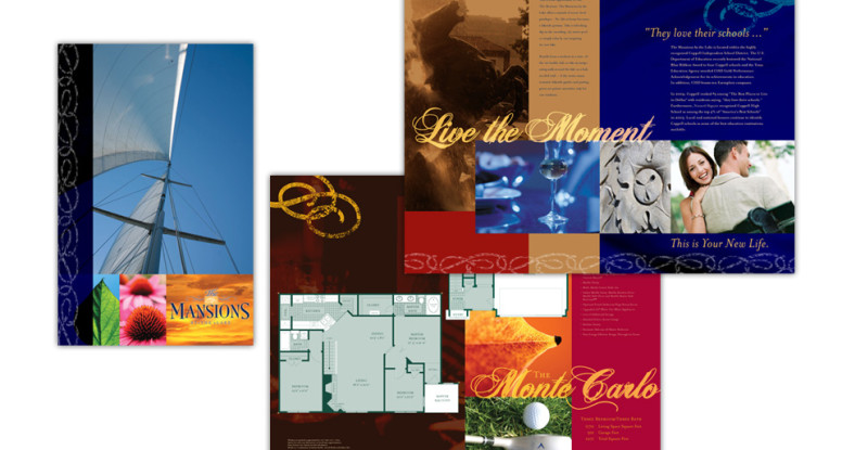
This 32-page 11″ x 17″ brochure is a beautiful, over-sized way to market apartment homes by the lake.
The photography is a combination of care-free lifestyle photos, sailing and lake imagery, and gorgeous nature & architectural details.
The color scheme is deep blue (for the lake, of course!), rich red and warm caramels and chocolates, mmmm.
We chose Heathen script typeface for the headlines because it’s upscale, but not uptight; and it provides extra punch when layered over the artwork underneath.
The look and feel of the brochure successfully conveys the lifestyle of the property, and shows off the large floor plans and lavish amenities. Who wouldn’t want to live here?
