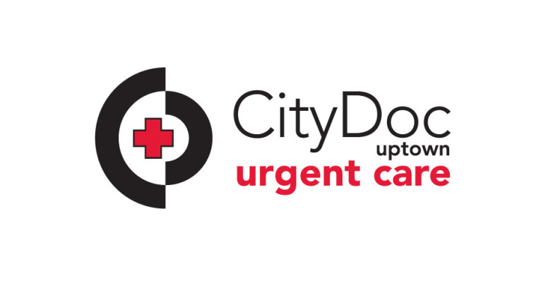
We designed this logo for an urgent care facility in Dallas’ Uptown neighborhood. Since they needed to market to a young professional, Dallas clientele, they wanted something fresh, bold and medical.
We chose to limit the graphics to a simple cross element and surround it by 2 semi circles that create an abstract “C” and “D” for CityDoc.
The type is flush right since that’s a more contemporary treatment; the uptown designation is small so it can be changed to other areas of town if they choose to expand outside of Uptown. It never hurts to think ahead!
We set “urgent care” in a bold red sans serif face to emphasize the service they offer. We chose the type family Avenir because it’s friendly, professional and easy to read.